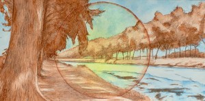
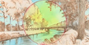
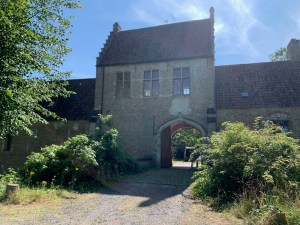
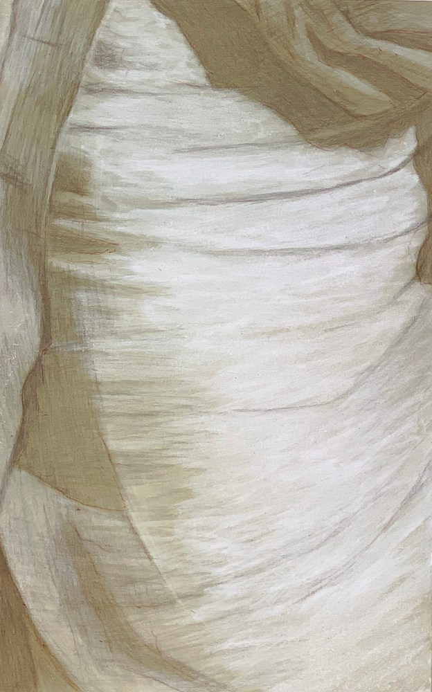
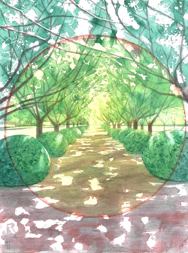
Category Archives: MODE

Listed according to their subject matter – or not.

Along the Damse Vaart. Watercolour on hot-pressed paper. 6" x 12".

Circle, Along the Damse Vaart

Along the Damse Vaart. Watercolour on hot-pressed paper. 6" x 12" or 11.5 x 32 cm
Along the Damse Vaart. Watercolour on hot-pressed paper. 6″ x 12″.

Another watercolour, a medium which by the way, is incredibly difficult to photograph. The colour of the spectrum of light influences the photograph. So if I try to create a photograph on a bright sunny day the subtle highlights become washed out. If I try to create a photograph on a cloudy day, there is an inevitable bluish tonality to the light. I can try to colour-correct for that using software but then colour is lost in the process. The highlights inevitably suffer. So suffice it to say that the image presented here is the best I can do to given my skills and conditions. Sigh, the warm yellow wash in the centre is underrepresented. OK.

Otherwise, I had a lot of fun doing this one. It is created on hot-pressed paper, whose flat texture allows for finer detail, especially with the (HB) graphite pencil. I continue to enjoy discovering the possibilities of working wet-in-wet, dry/saturated-in-wet, wet-on-dry or even dry/saturated-on-dry (not much of that last one here). I continue to explore a reduced, complimentary palette within a circular motif. I didn’t use any masking fluid on this one, however I did make use of paper towels to blot back areas of a dark wash, like in the soft dappled light on the tree or foreground on the left.

Unframed. $50 or 50 Euros plus shipping and handling.

Please contact me if you are interested.

Fifteen minute study. Conté crayon tightened with pastel on tinted Canson paper. 32 x 50 cm.

Figure Drawing, August 22, 2022

Three minute gesture study. Charcoal on tinted sketching paper. 35 x 50 cm.

Three minute gesture study. Charcoal on tinted sketching paper. 35 x 50 cm.

Fifteen minute study. Conté crayon tightened with pastel on tinted Canson paper. 32 x 50 cm.

Fifteen minute study. Conté crayon tightened with pastel on tinted Canson paper. 32 x 50 cm.

Last night I was happy to see our beautiful young man there again. He has slowly become more relaxed and creative as he learns the posing ropes. Nice. But indeed it was to be his last evening modeling for us, as the summer winds down and soon he will be off to school. But I did discover his name, Kobe, like the Lakers’ famous basketball player. Ha!

Additionally, I had also heard that last night was going to be our last evening at the kasteel (!) but in fact, that’s next week. 😦 Turns out, is was only a summer lease as there is no heating in the place and barely enough electricity for some spot lights, so we will have to go elsewhere. Apparently a new location has already been found – and with a year’s lease. Though sessions will not begin again until the end of October. OK.

Fifteen minute study. Conté crayon tightened with pastel on tinted Canson paper. 32 x 50 cm.

Fifteen minute study. Conté crayon tightened with pastel on tinted Canson paper. 32 x 50 cm.

Three minute gesture study. Charcoal on tinted sketching paper. 35 x 50 cm.

Three minute gesture study. Charcoal on tinted sketching paper. 35 x 50 cm.

Back to tonight. It was one of those evenings where for some reason it took me awhile to warm up. The first half did not yield any keepers but the second half did. I had purchased some new Canson paper in a grey-brown hue which I was eager to try out. The two fifteen minute studies displayed here are from that batch. Since it is a lighter tonality than the sepia I have been using, I can see that in the future I will want to leave enough time to zap in some shadow accents, too. As it is, I feel these two displayed here are quite successful though a little too light overall in tonality.

As the evening progressed I found myself repeating an artist’s mantra that a friend of mine who studied at the Ecole de Beaux Arts back in the seventies once shared with me:

  • mise en page (placement on the page)
  • circulation de la lumèire (circulation of the light)
  • ne tombe pas dans les détailes (don’t fall into the details)

The first one is appropriate for any two dimensional drawing (like the three minute gestures) but the second two are especially useful for the fuller development of any drawing (for example, the fifteen minute poses included here). Also, you do not need to restrict yourself to figurative work to apply these rules. They apply to abstraction and can help you to evaluate why a good abstract piece actually works – when it does. And, as I think about it, I would add a fourth: the appeal of texture. En français: l’attrait textuel?

The Schipdonk Canal. Watercolour on cold pressed paper. 6" x 12"

The Circle Game or Homage to the Circle

I returned to Ruskin’s “The Elements of Drawing” this summer. (It’s always good to start anew and never assume that you know whatever you think you know – because most likely, you don’t) So as I was playing around with watercolours, Ruskin suggested creating shapes and filling them in, beginning with the most basic of shapes, the circle. I was creating these sun-like shapes on a landscape oriented pad, 6″ x 12″ and immediately wanted to superimpose a real landscape over it. So I did.

The Schipdonk Canal. Watercolour on cold pressed paper. 6" x 12"

The Schipdonk Canal. Watercolour on cold pressed paper. 6″ x 12″ SOLD

The first in the series, was of a scene along the Schipdonk canal somewhere around Eeklo. Since I thought it turned out rather well, I thought, hmmmm…., this could be the beginning of a beautiful friendship? I liked the serendipitous contribution of the sun-like circle, compositionally and chromatically, enhancing its one-point perspective. I also liked the idea of doing the landscape in a simplified colour scheme  of two complimentary colors. I began to imagine doing more, particularly of my favourite scenes around here.

Farm on the Damme Vaart. Watercolour (Alizarine Crimson and Thalo Green Light) on cold pressed paper. 6" x 12"

Farm on the Damme Vaart. Watercolour (Alizarine Crimson and Thalo Green Light) on cold pressed paper. 6″ x 12″

The second in the series then is of a farm along the Damse Vaart that I have painted in the past. I really like the sweet, afternoon light on the farm buildings in the middle ground but have struggled to make it an interesting composition. Would this circle approach help? I decided to try it with a green/red palette, The result was OK, but compositionally, still rather static, so I enhanced the golden circle with an external wash of purple. It felt pretty rad. 🙂  

Framed. $50 or 50 Euros plus shipping and handling.

Bend in the Damme Vaart. Watercolour (Thalo Blue and Burnt Sienna) on cold pressed paper. 6" x 12"

Bend in the Damme Vaart. Watercolour (Thalo Blue and Burnt Sienna) on cold pressed paper. 6″ x 12″

Well, OK, what’s next? I have plenty of favourite spots around here, so I chose another one further along the Damse Vaart, this time at its bend (which I have also painted in the past). I ended up doing three different versions of it: the first in a ‘normal’ colour scheme’ (boring!); the second in Thalo Blue/Burnt Sienna but with a horizon line that was about a 1/2″ too high (ugh!, toss); and the last one (pictured here) with the Blue/Sienna colour scheme but a lowered horizon line ( it finally felt right chromatically and compositionally).

Framed. $50 or 50 Euros plus shipping and handling.

Luckily these small experiments are easy to do so there’s more to come. Stay tuned…

Please contact me if you are interested in either of the DaamseVaart pieces.

Conté crayon on Canson tinted paper. 30 x 50 cm.

Figure Drawing, August 8, 2022

Conté crayon on Canson pastel paper. 30 x 50 cm.

Fifteen minute study. Conté crayon on Canson pastel paper. 30 x 50 cm.

Conté crayon on Canson tinted paper. 30 x 50 cm.

Fifteen minute study. Conté crayon on Canson tinted paper. 30 x 50 cm.

Tonight we had another new model. New to us but also new to being a model for figure drawing. So, besides setting the length of the poses, Patrick, our new co-ordinator, does not tell the models what to do. (Bruno our last maître didn’t either) It’s always best to let the model sit, stand or lay in ways that are comfortable to them. Then we figure out how to make that interesting.


All that being said, there are models who intuitively understand what makes for a good pose. In that context, our new guy seemed to possess a comfortable bodily solidity so that the poses he took, though extremely simple and without any contrapasto or inner movement, were quite interesting to draw. That was my experience at least. These are a few fifteen minute studies as well as some three minute gesture drawings.

Three minute sketch, charcoal on tinted sketching paper. 35 x 50 cm.

Three minute sketch, charcoal on tinted sketching paper. 35 x 50 cm.

Three minute sketch, charcoal on tinted sketching paper. 35 x 50 cm.

Three minute sketch, charcoal on tinted sketching paper. 35 x 50 cm.

Fifteen minute pose.Conté crayon tighten with pastel on toned Canson pastel paper. 30 x 50 cm.

Figure Drawing August 1, 2022

Fifteen minute pose.Conté crayon highlighted with pastel on Canson paper. 30 x 50 cm.

Fifteen minute pose. Conté crayon highlighted with pastel on Canson paper. 30 x 50 cm.

Fifteen minute pose. Conté crayon highlighted with pastel on Canson paper. 30 x 50 cm.

Fifteen minute pose. Conté crayon highlighted with pastel on Canson paper. 30 x 50 cm.

We were so lucky to have the same model again tonight.  I smiled to see him and could observe over the course of the evening that he was a little more relaxed this time. He even brought his girlfriend and the two of them modelled together during the second half.

All that being the case (the first half or the second) I did not feel that I had a very successful catch for the night. The double session drawings did not play out for me. (Both were very sweet but unsure how to make such a venture interesting for us to draw.)

Three minute pose. Charcoal on toned sketching paper. 35 x 50 cm.

Three minute pose. Charcoal on toned sketching paper. 35 x 50 cm.

Displayed here then are a few that made the grade.

Fifteen minute figure study. Conte crayon highlighted with patel chalk on Canson paper. 30 x 50 cm

Figure Drawing July 25, 2022

Fifteen minute figure study. Conte crayon highlighted with patel chalk on Canson paper. 30 x 50 cm.

Fifteen minute figure study. Conte crayon highlighted with patel chalk on Canson paper. 30 x 50 cm

A new model tonight. A classically beautiful young man. Strong, healthy. He reminded me of a young puppy that is now growing/becoming a big dog. So his head, hands and feet were slightly larger proportionally than the rest of his body. At maybe 17 years old, he appears to be on the cusp of catching up. A wonder to behold. Shy, actually tense: this was his first time.

Fifteen minute figure study. charcoal highlighted with pastel chalk on sketching paper. 35 x 50 cm.

Fifteen minute figure study. charcoal highlighted with pastel chalk on sketching paper. 35 x 50 cm.

I really enjoyed drawing him though, allowing even his tension to reflect through. As it turned out, I think the fifteen minute studies were the more successful. This is because a three minute pose is all about gesture. And it took him awhile to get gestural, to relax. With one exception, his short poses were not very interesting (to me). I had difficulty getting a quick read. But the longer ones allowed time for roving and searching and because he had such a solid figure there was plenty of material to feel my way through.

Fifteen minute figure study. Conte crayon highlighted with patel chalk on Canson paper. 30 x 50 cm

Fifteen minute figure study. Conte crayon highlighted with patel chalk on Canson paper. 30 x 50 cm

Three minute gesture study. Charcoal on sketching paper. 35 x 50 cm.

Three minute gesture study. Charcoal on sketching paper. 35 x 50 cm.

A few fifteen minute studies. and one three minute gesture.

Conté crayon on pastel paper.

Figure Drawing, July 18, 2022

15 minute pose. Charcoal on toned sketching paper.

15 minute pose. Charcoal on toned sketching paper.

Rear entrance to Kasteel Rooigem in Sint Andries, Belgium

Rear entrance to Kasteel Rooigem in Sint Andries, Belgium

After a very long hiatus (2.5 years!) the open studio figure drawing sessions here in Bruges have finally resumed. Hooray!!! During this interim, while the pandemic raged, Bruno Van Dyck, our resident artist-host, moved to a new studio in an old castle. Thanks to him, we now have a lovely setting for drawing in an outbuilding of the (former) Bishop’s Palace, on the outskirts of town. A great setting: some clouds do have a silver lining.

3 minute pose. Charcoal on toned sketching paper.

3 minute pose. Charcoal on toned sketching paper.

15 minute pose. Conté crayon on toned Canson paper.

15 minute pose. Conté crayon on toned Canson paper.

So the place is new but the crew and the set-up is not. Bruno too, has passed the baton to a new “master of ceremonies”, who now collects our coins and instead of delicious jazz or fantastic guitar licks plays Piaf and French chansons. For a Belgian castle it all seems quite appropriate. Maybe next week we’ll get Jacques Brel? As the session began I wondered how rusty I would feel but as it turned out, there were a few keepers for the night. Included here are a few – plus the castle’s back door entrance.


#13 Silverpoint on tinted panel, highlighted with titanium white.

Silverpoint underdrawings, batch #4

Perhaps because I haven’t posted in awhile, a number of friends have asked recently if I am still working on my silverpoint drawings. The answer is emphatically: “Yes!”. Since I’ve had a few other projects on my plate, I just haven’t done a post. So here is batch #4.

Actually, I am coming down the home stretch of these sixty four (underdrawing) panels (there are still twelve left to do). Each is a jewel in its own right, though clearly some are more interesting compositionally than others. I had  about thirty panels to sort through in order to select these five to showcase here.

As you’ll see, the panels that contain body parts with differing textures and conditions of light make for the most interesting compositions. It’s important to recognise that the silverpoint can never create a really dark line. The best that’s achievable is a 50% warm grey (which is drawn on a panel already tinted with a terra verte toned ground). So after transposing the basic form-describing lines, I fill in the dark values with silver cross-hatching. Through this process, the three quarter tone, deep shadow information inevitably gets lost however the composition does come to life when I introduce tints of (acrylic) titanium white.

Underdrawing in silverpoint #36 over toned ground, highlighted with white.

Silverpoint underdrawings, batch #3

Silverpoint underdrawing #38 on toned ground highlighted with acrylic.

Silverpoint underdrawing #38 on toned ground highlighted with acrylic.

After a long hiatus (at least from here) I’ve got another batch of silverpoint underdrawings to publish. These were created during our recent trip to California – in my new studio there. The new studio is in our garage, so besides the new working-space, I envision that I will have more room there to create larger pieces (who needs cars anyway?). My current working-space here in Belgium measures about 4 x 10 feet but since Euro-compression-design rules the day I have been able to pack many useful features into it. Still. it’s cramped.

Underdrawing in silverpoint #57 on toned ground highlighted with white.

Underdrawing in silverpoint #57 on toned ground highlighted with white.

When I began this project I knew of course that the silverpoint pencil nib is quite restrictive, so the challenge in these panels is how to render various highly textured, amorphous and abstract shapes with a very fine, low in value line. Mostly impossible. For many of these compositions then, if I were to use just silverpoint, I’d have only very flat uninteresting underdrawings to offer. But since they are executed on a toned ground, the addition of the while highlights (using tubes of titanium white in acrylic) allows for greater manipulations. Washes quickly establish the tonality, texture and gesture – things which are otherwise difficult to achieve in silverpoint alone.

Underdrawing in silverpoint #36 over toned ground, highlighted with white.

Underdrawing in silverpoint #36 over toned ground, highlighted with white.

The silverpoint then establishes the basics of the design and hints toward the darker values, while the white moves the image forward. I enlisted the help not only of brushes but also sponges, hands and fingers. And since each panel is about the size of a standard book, I could rotate the panel to get my washes to drip in whatever direction I needed. Nice. That’s really hard to do with a big panel or canvas. 😉

Underdrawing in silverpoint #58 over toned gesso, highlighted with white acrylic.

Underdrawing in silverpoint #58 over toned gesso, highlighted with white acrylic.

All in all I created fourteen panels during this recent time. They are still resting in their little beds in California, however I was able to take some photographs of them before leaving. I’m hoping to put the whole series together during our next trip, where I will have enough space to throw some paint at the final assemblage. As ever, we’ll see.

Silverpoint underdrawing on toned gesso ground. 13.3 x 21 cm or 5 1/4 x 8 1/2 in.

Silverpoint underdrawings, batch #2

Silverpoint underdrawing #05 on toned gesso ground. 13.3 x 21 cm or 5 1/4 x 8 1/2 in.

Silverpoint underdrawing #05 on toned gesso ground. 13.3 x 21 cm or 5 1/4 x 8 1/2 in.

I’ve completed six more panels, so I figure it’s time for an update. Illustrated here are a few of those that I that have found to be particularly interesting/beautiful for various reasons. The most evocative appear to be those whose compositions include human beings or parts thereof. It’s as though each one is from some unwritten comic book – captions not included (Hergé would have understood). Additionally, the abstract panels cause me to wonder/admire anew at how the iconoclastic impulse of Islamic art continues to produce such interesting varieties of texture and pattern.

Silverpoint underdrawing #07 on toned gesso ground. 13.3 x 21 cm or 5 1/4 x 8 1/2 in.

Silverpoint underdrawing #07 on toned gesso ground. 13.3 x 21 cm or 5 1/4 x 8 1/2 in.

Further, one very general note. I feel I am serendipitously creating 21st century daguerreotypes(!). (Who knew?) It’s as though by using silver to recreate images based on a digital photograph the mechanistic process has come full circle: human to machine back to human. And again, because the drawing stylus is silver it’s almost impossible to achieve a line that is darker than a 50% grey value. All values are compressed thereby, necessitating a multitude of small decisions. Adding in the white highlights makes each panel come alive – my own gevoelsmatig pleasure.

Silverpoint underdrawing #11 on toned gesso ground. 13.3 x 21 cm or 5 1/4 x 8 1/2 in.

Silverpoint underdrawing #11 on toned gesso ground. 13.3 x 21 cm or 5 1/4 x 8 1/2 in.

The raison d’être for these remains as underdrawings. And I have no doubt that their beauty and subtlety will contribute to the whole in as-yet-to-be-experienced ways. However, some will be held back for individual display and appreciation. For this, I think I have a plan…