Category Archives: Acrylic

Paintings executed exclusively in acrylic.

Casablanca-=Rosa, acrylic over silverpoint. 12" x 18.5" or 30.5cm x 47cm

Random Acts of Kindness and such

Random Acts of Kindness Series I, acrylic over silverpoint. 12" x 18.5" or 30.5cm x 47cm

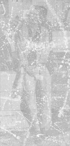
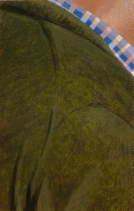
Random Acts of Kindness Series I, acrylic over silverpoint. 12″ x 18.5″ or 30.5cm x 47cm.

In January I experienced a flurry of creative activity. This was inseminated by an upcoming gallery exhibition themed around the colour red (for Valentine’s Day) – and in which I had hoped to participate. I realised that the sixteen leftover terra verte panels from my big silverpoint project could provide a great background for splashes of its complement: venetian red. Terre verte (consisting of celadonite and glauconite) and venetian red (iron oxide or hematite) are both ancient earth pigments with a long history of artistic usage. As stand alone colours or complements they evoke a deeply grounded reaction which is far more subtle than the bright cadmium reds and/or the phthalo greens of the modern palette. For myself, I don’t mind shocks of colour, but my temperament is generally interested in subtlety so I decided to give this little tryst a try.

Casablanca-Rosa, acrylic over silverpoint. 12" x 18.5" or 30.5cm x 47cm

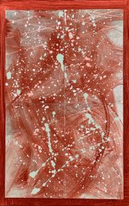
Casablanca-Rosa, acrylic over silverpoint. 12″ x 18.5″ or 30.5cm x 47cm

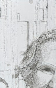
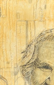
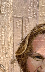
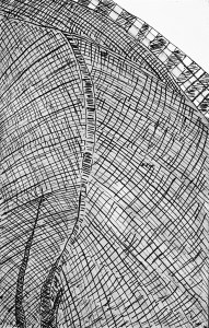
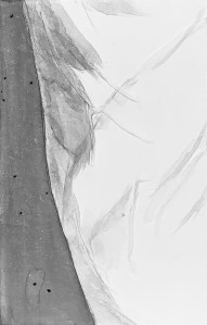
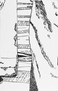
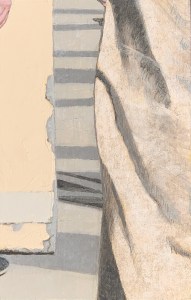
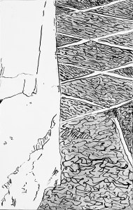
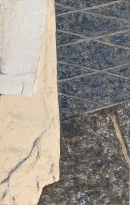
On each panel I transposed a design (from one of the sixty four panels of the silverpoint project) that I already thought had potential as a stand alone composition. I worked up these silverpoint drawings and washed in the titanium white highlights as usual. That was the realistic phase. After fixing this layer I began abstraction by spattering in dilutions of titanium white. After that dried I covered each panel with some acrylic transparent glaze/extender, dipped a large synthetic brush into some Venetian red and slashed across the underlying composition. In some cases I did this to each panel, that is, individually, in other cases I did it to groups of four which, when placed together, formed a deconstructed yet still realistic section of the original image.

I liked these red slashes yet, I also felt the need to reiterate/reintegrate the terre verte. So I mixed some of that up and spattered it across the panels. Nice, it created a complementary “pop/contrast” as well as the harmony that I was looking for. The panels were now done,  but still, I  was only halfway.

The next question: how to display them?

Let's get to the Heart of the Matter, acrylic over silverpoint. 12" x 18.5" or 30.5cm x 47cm

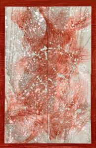
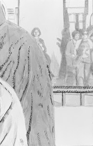
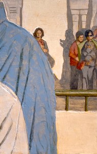
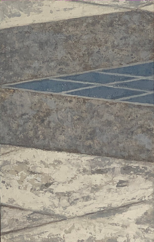
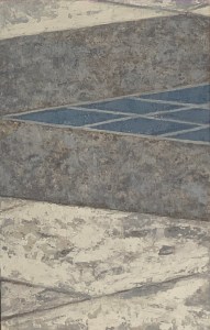
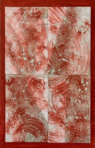
Let’s get to the Heart of the Matter, acrylic over silverpoint. 12″ x 18.5″ or 30.5cm x 47cm

I glued little wooden strips to the back of each (MDF) panel. This allowed me to staple in a piece of velcro. I then built some plywood backing boards to receive the companion side of the velcro. I washed these boards with white gesso (to reduce the visual contrast of the naked plywood). Nice, but ultimately I decided against white and coated the backing boards with a layer of venetian red. This supplied the superimposed panels with a solid warm border/base, allowing them to be spotlighted/ to shine.

I called the group of individual panels “Random Acts of Kindness”, while the groupings with four interrelated panels received a name appropriate to their original imagery, “Let’s get to the Heart of the Matter” and “Casablanca-Rosa”, respectively, see the illustrations above. Oh, and “no hard feelings but”, they were not selected for the galley exhibition. 😦 Still, I’m grateful for the stimulus and am sure they will find a happy home someday, somewhere.

Advertisement
Pieces of Me/Pieces of Eight. Titanium white over silverpoint. Final size: 106.5 x 168 cm or 42" x 66"

Pieces of Me/Pieces of Eight/Pieces of White

Pieces of Me/Pieces of Eight. Titanium white over silverpoint.  Final size: 106.5 x 168 cm or 42" x 66"

Pieces of Me/Pieces of Eight. Titanium white over silverpoint. Final size: 106.5 x 168 cm or 42″ x 66″

I’ve recently been able to complete this silverpoint inspired project – which is intended as a mix of realism and abstraction.

The underdrawing stage illustrated and described here consisted of sixty four panels rendered in silverpoint over a terre verte toned acrylic ground, highlighted with titanium white. After applying appropriate fixative, the overlaying layers consisted primarily of titanium white (there was also a tidge of zinc white) – either sprayed or thrown – in alternating sessions until I was satisfied with the result.

It was fun doing this second phase yet also challenging: it’s my first experience with throwing paint since my college days. So  I had an internal image, but didn’t know exactly how to get there. It was a case of trial and error. My guiding principle was “circulation de la lumière” (the circulation of light). Naturally, that circulation had to take into account the highlights, quarter-tones and half-tones of the underdrawing. But the throwing itself involved a certain kind of chaos which I couldn’t really control, but rather at best, guide. The final size is approximately 3 1/2 feet x 5 1/2 feet. Basically, life size.

The final version displayed here is (of course) a photograph. As such it is a kind of compromise, not only because of my photography skills (but possibly anyone’s) to adequately represent this piece. The silverpoint layer reflects and resonates depending on the lighting conditions (and your position in the room) while the overpainted layer of titanium white, as a very opaque pigment, simply reflects.

With ambient lighting conditions more of the underdrawing softly comes through, while with strong overhead light the overpainted splashes become emphasised. My intention is/was to achieve an alternating balance between the two so that the viewer can receive alternating impressions. For all these reasons it’s important to cut this digital image some slack. So no, there will be no NFTs made available of this anywhere on the internet. 😉

With luck I hope to exhibit it somewhere, sometime in the relatively near future. TBD.


A Piece of Me #04, acrylic over collage on panel. 21 x 13.3 cm or 5 1/4 x 8 1/4 in.

A Piece of Me #04, acrylic

A Piece of Me #04, underdrawing in ink wash and pen and ink.

A Piece of Me #04, underdrawing in ink wash and pen and ink.

A Piece of Me #04, after the imprimatura.

A Piece of Me #04, after the imprimatura.

Finally, the last of the acrylics series. I saved this panel for the last knowing it could be quick work if I was lucky, but I would have to be on top of my game.

Compositionally this included a section of my face and hair against a background of architectural shapes. The light came in strongly from the right.

The work up for the panel was collage. So I used sections of an old pleated linen shirt for the background, then cut up long, thin strips of cloth for the strands of my hair. When it came to sculpting my face I used thick pieces of linen and even glued in a thicker piece underneath for my eyebrow.

I drew in the composition with washes of india ink (above, left), then coated the panel with yellow ochre for an imprimatura and added in darker accents with pen and ink (above, right). On top of that I gave the face a green underpainting (no photograph of that stage). Painting skin tone this way always looks so ghoulish at the start but it’s fantastic for achieving chromatic dimensionality very quickly. After all, blue veins do pulse under our warm, translucent flesh.

A Piece of Me #04, acrylic over collage on panel. 21 x 13.3 cm or 5 1/4 x 8 1/4 in.

A Piece of Me #04, acrylic over collage on panel. 21 x 13.3 cm or 5 1/4 x 8 1/4 in.

During the alia-prima painting phase I painted in the white tonalities of the background first, then proceeded to the hair and face. Things began to come alive very quickly. After the (cool, pinkish) skin tone dried I laid in a glaze of yellow ochre to warm it all up and decided to stop. Some might consider this to need more work, that is, to bring it to a fuller, more developed state of completion since the underdrawing is still quite visible in places. But I fear if I continued I would lose its freshness and spontaneity. There is plenty of suggestion; already there is a lot going on. So I will stop and call this one yet another haptic-happening.

Description of the overall project here. Technical write up of my use of acrylics for indirect painting in this project here.

A Piece of Me #14, acrylic over acrylic sculpted gel on panel. 21 x 13.3 cm or 5 1/4 x 8 1/4 in.

A Piece of Me #14, acrylic

A Piece of Me #14, underdrawing.

A Piece of Me #14, underdrawing in india ink.

A Piece of Me #14, acrylic over acrylic sculpted gel on panel. 21 x 13.3 cm or 5 1/4 x 8 1/4 in.

A Piece of Me #14, acrylic over acrylic sculpted gel on panel. 21 x 13.3 cm or 5 1/4 x 8 1/4 in.

Whew! one of the most challenging panels yet! Why so?

To begin with the composition was very complicated – in the middle distance. There were three explicit figures plus a number of other shadows, all jumbled up together in the original photograph. I had to disentangle and determine the significant shapes and forms. Deciding what to keep and what to toss.

Secondly, the values in the middle distance in the original photograph were darker than I preferred so I had to figure out t how to to modulate them appropriately so that they will match the other panels in this row in the final assemblage.

Thirdly, the set-up for this particular panel called for acrylic sculpting gel as part of the work-up for the substrate. The painting was executed upon this relief. This posed an additional challenge due to the undulations in the painting surface of the painting knifeused for creating the relief. It made the surface coarser and more textured than I prefer. But since that’s part of the self-imposed rules for this particular game, off I went.

Technical write up of my use of acrylics for indirect painting in this project here.

A Piece of Me #26, acrylic on panel. 21 13.3 cm or 5 1/4 x 8 1/4 in.

A Piece of Me #29, acrylics

A Piece of Me #26, underdrawing in pen and ink.

A Piece of Me #26, underdrawing in pen and ink.

A Piece of Me #26, acrylic on panel. 21 13.3 cm or 5 1/4 x 8 1/4 in.

A Piece of Me #26, acrylic on panel. 21 x 13.3 cm or 5 1/4 x 8 1/4 in.

This panel presented an interesting contrast of values and hues. Strong black shirt and effects of light and shadow contrasted to a muted linen jacket and nuanced flesh tones. Additionally, the panel was untreated. I am coming to recognise this treatment (or lack thereof) presents a particular challenge to the painter. The paint is simply more difficult to manipulate.

Given all that I am pleased with the outcome. The jacket undulates, the shadows read, the flesh pulses. I wonder what time it is on that watch?

Overview of the entire project here. Technical write up of my use of acrylics for indirect painting in this project here.

A Piece of Me #09, acrylic on panel. 21 x 13.3 cm or 5 1/4 x 8 1/4 in.

A Piece of Me #09, acrylics

A Piece of Me #09, underdrawing in pen and ink

A Piece of Me #09, underdrawing in pen and ink

A Piece of Me #09, acrylic on panel. 21 x 13.3 cm or 5 1/4 x 8 1/4 in.

A Piece of Me #09, acrylic on panel. 21 x 13.3 cm or 5 1/4 x 8 1/4 in.

Moving into the figurative pieces now especially those with serious flesh tones. This composition was mostly sweater, a little shirt and a piece of neck.

The approach called for an un treated panel (so no cotton or linen glued to the substrate to soften the blow). That meant that the strokes would speak for themselves and also would be a little slow in drying. If you take that into account, no problem, but if you try to work too fast (which I did) you can experience “holes” where the paint suddenly lifts off the surface whenever you work back over it. So this happened today while working on the man’s neck. The paint lifted off revealing two green blotchy holes (exposing the underpainting) in the highlighted area. Ha! I had to just stop and take a break. An hour later the surface was dry enough that I could stipple in a patch to match. This evened it all back up. No problem.

Nevertheless, the skin tone itself was a success story of indirect painting. I laid a green toned underpainting over the yellow ochre imprimatura. Then I mixed up three tints of venetian red (the Renaissance painters called that sinopia) to develop the form. When that work dried, I sponged in a yellow ochre glaze. Pop! Yummy flesh.

Another fun challenge was the sweater. I wanted to give it some movement as well as indicate the chiaroscuro of the body form beneath it. The underdrawing already indicated some movement, so I tried to let it speak though my strokes. After I was done working in the large forms and movements, I adjusted the colour with a sponged in glaze of cadmium yellow (bright!). That turned it from an almost dark-olive grey to a bright, delicious green. I’m pretty happy with the way it all turned out.

I might not want to eat that sweater but I wouldn’t mind a quick snuggle.

Overview of the entire project here. Technical write up of my use of acrylics for indirect painting in this project here.


A Piece of Me #44, acrylic over collage on panel. 21 x 13.3 cm or 5 1/4 x 8 1/4 in.

A Piece of Me #44, acrylics

A Piece of Me #44, underdrawing in ink wash.

A Piece of Me #44, underdrawing in ink wash.

A Piece of Me #44, acrylic over collage on panel. 21 x 13.3 cm or 5 1/4 x 8 1/4 in.

A Piece of Me #44, acrylic over collage on panel. 21 x 13.3 cm or 5 1/4 x 8 1/4 in.

A foreground composition from the whole assemblage. It happened very quickly, but that was because I had already done so much preparatory work.

At the substrate stage I had glued in a collage to reflect the movements and folds of my pants leg. That was a lot of fun and ended up being one of my favourite collages. Then at the underdrawing stage I laid in some black and white washes to reflect the strong value contrasts of the composition, see top right. I covered the whole panel with a coat of yellow ochre imprimatura  and set to work.

I mixed up three tints of gray in addition to the titanium white and began filling in the chiaroscuroed pants. I mixed up raw umber with a touch of ultramarine blue for the deep shadow, then laid it in with a brush and a small celled sponge. I increased the value-intensity-depth of the shadowed side pock-marks to enhance visual interest. After about a half hour I had what I was looking for.

Amazing what a little suggestion can do. Technical write up of my use of acrylics for indirect painting in this project here.

A Piece of Me #19, acrylic over linen on panel. 21 x 13.3 cm or 5 1/4 x 8 1/4 in.

A Piece of Me #19, acrylics

A Piece of Me #19, the underdrawing in pen and ink.

A Piece of Me #19, the underdrawing in pen and ink.

A Piece of Me #19, acrylic over linen on panel. 21 x 13.3 cm or 5 1/4 x 8 1/4 in.

A Piece of Me #19, acrylic over linen on panel. 21 x 13.3 cm or 5 1/4 x 8 1/4 in.

Beginning to plunge into the compositions that contain figurative elements. In this case, a part of my linen jacket in the foreground, a plastered wall, tips of hands and shoes in the middle ground and tiles receding into the distance.

Primarily because acrylics are so siccative, brush strokes can be hard to mask, that is, if you don’t want them – and generally, I don’t. So you have to revert to other methods. Like the previous panel, I used the painting knife and a small sponge to achieve textures that were not dependent upon or dictated by a paint brush. For example, after freely brushing in the chiaroscuro of the linen jacket (and letting it dry), I used some raw umber on the sponge to darken but soften it all up. The same with the receding tiles. After laying them in somewhat graphically, I used the sponge to lighten and mottle them up.

Additionally, because this whole project is conceived of as an experiment in substrates, the texture of the substrate also needs to be accounted for. In this case I was painting upon a panel prepared with a coat of linen glued to it before the gesso coating. Fabric/linen is perhaps the most favourable substrate for acrylic. The linen easily absorbs the paint as well as its tooth catches the stroke in its weave. This is also true for oils.

In contrast, it’s a remarkably different feel to paint upon a wooden panel with no intervening cloth, just gesso. The stroke is what it is – and receives no additional assistance from the texture of the substrate. For egg tempera this is exactly what you want. Because the egg tempera is so fine and graphical the coarse texture of a fabric’s weave can interfere. Also, if you paint on panels with oils, there is the additional difficulty of actually getting the stroke to actually stick to the slick surface (at the beginning of a painting session a light coat of varnish that is immediately wiped back off before drying helps with that). Anyway, the choice of substrate does indeed play a role in the touchy-feely way that paint performs.

Technical write up of my use of acrylics for indirect painting in this project here.


A Piece of Me #39, acrylic over linen on panel. 21 x 13.3 cm or 5 1/4 x 8 1/4 in.

A Piece of Me #39, acrylics

The muted tonalities and textures of a pattern of floor tiles. Located somewhere in the middle ground of the overall composition.

A Piece of Me #39, underdrawing in pen and ink

A Piece of Me #39, underdrawing in pen and ink

A Piece of Me #39, acrylic over linen on panel. 21 x 13.3 cm or 5 1/4 x 8 1/4 in.

A Piece of Me #39, acrylic over linen on panel. 21 x 13.3 cm or 5 1/4 x 8 1/4 in.

Perhaps the most interesting aspect of creating this panel was the extent to which I did not use the brush. The lighter sections above and below were done with a highly flexible painting knife, while the dark grey and blue tiles were created though the sequential dabbings of a small celled sponge. It was only the grouting lines (and small touch ups) that necessitated the use of a brush.

So, open textures broken by linear graphical shapes, while neutral grey forms a pretty steady through line. From a purely chromatic point of view some people might feel that grey element to be a bit too somber for their tastes. I get it, but as a tonalist, I feel it creates a peaceful serenity – so I really like it.

Technical write up of my use of acrylics for indirect painting in this project here.

A Piece of Me #54, acrylic over acrylic modelling paste on panel. 21 x 13.3 cm or 5 1/4 x 8 1/4 in.

A Piece of Me #54, acrylics

A Piece of Me #54, pen and ink underdrawing.

A Piece of Me #54, pen and ink underdrawing.

A Piece of Me #54, acrylic over acrylic modelling paste on panel. 21 x 13.3 cm or 5 1/4 x 8 1/4 in.

A Piece of Me #54, acrylic over acrylic modelling paste on panel. 21 x 13.3 cm or 5 1/4 x 8 1/4 in.

With this panel I began moving into some of the more figurative elements of the foreground in the overall composition. The preparation called for some pre-painting sculpting, so I used acrylic modelling gel. I sculpted the surface according to the elements of the composition: the tiles with their grouted grooves receding into the background on the right, on the left, the chipped plaster wall in front of which you see the undulating tip of my pants leg. Thus, fabric, plaster, stone.

I began painting with the yellow plaster wall. It had already been sculpted but I decided to increase it’s texture by using the painting knife. Then I dug out all the chipped grooves and lay in some gray paint. I painted in a good coat of white on my pants leg and let it all dry. It was already taking shape but the big fun began with the sponge. After blocking off the left side I daubed out tones of gray, raw umber and ultramarine blue into the tile design on the right. Results came quickly. Of course I had to move quickly to reclaim the grouting lines. But instead of leaving the grooves as a tint of the exposed substrate, I came back in with a neutral grout-gray to clean it all up. Pop!

After everything dried I used raw umber to apply some stains onto the plaster wall and to put some volumetric washes onto my pant leg. I’m really happy with the way this one turned out.

It’s very haptic. I could eat it for breakfast.

Technical write up of my use of acrylics for indirect painting in this project here.