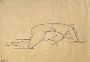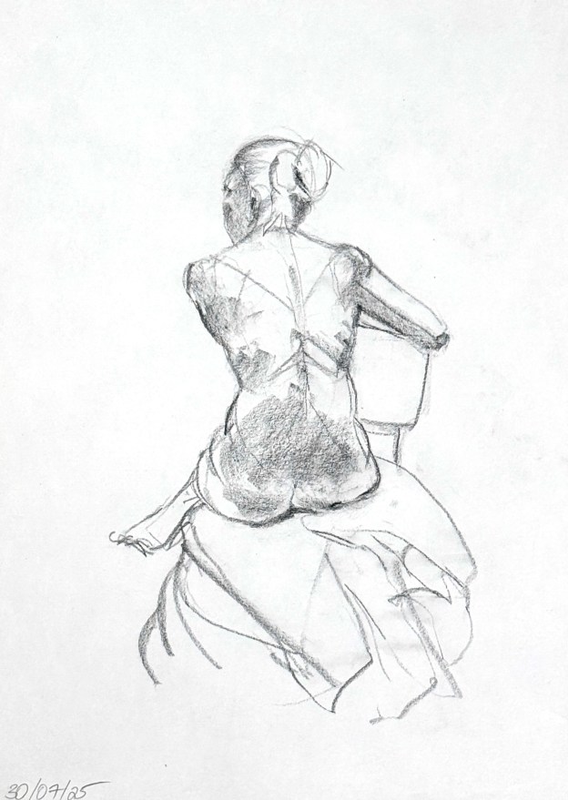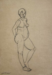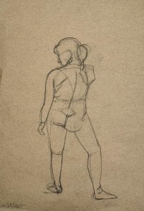
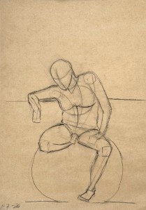
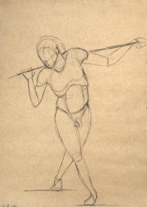
Fantastic model tonight. Willing and interested to do and create interesting poses. He even brought some of his own props. Cool! Thus the drawings selected here reflect the ambitious nature of some of his twists and turns.
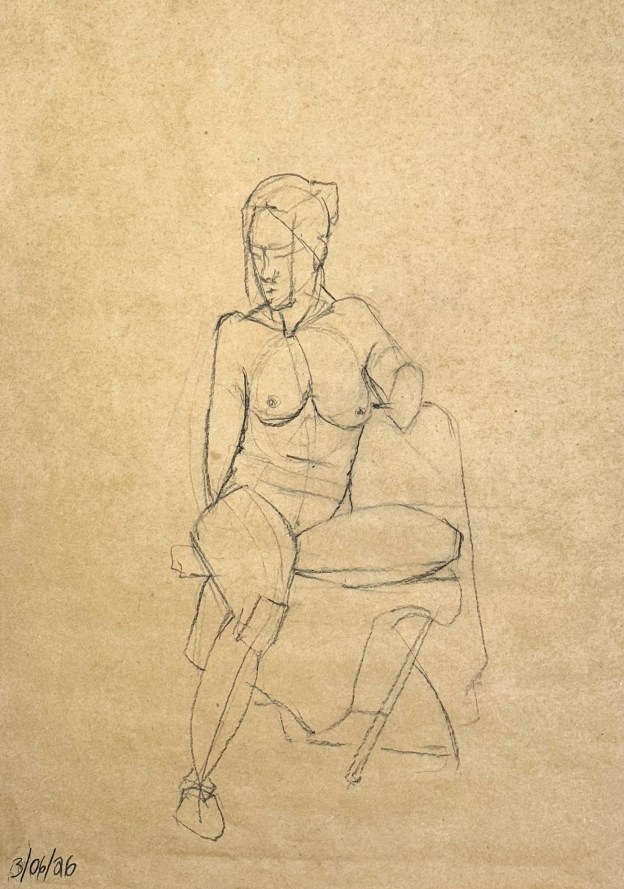
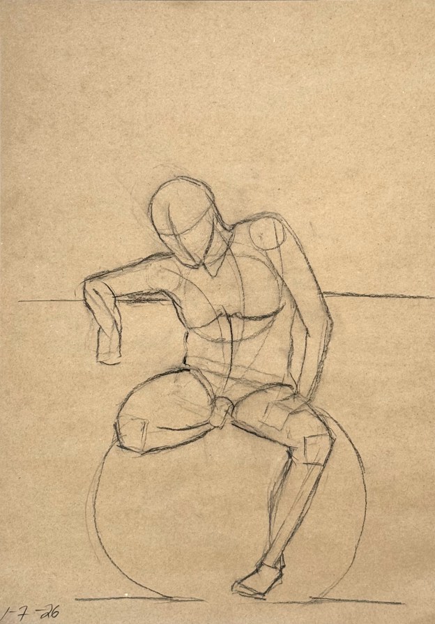
The graphical schematics I have been learning @ Watts are visible in some of the drawings, too. The spotlighted image above is perhaps the best example of that. What I find so helpful is not only the linear gesture of the Reilly rhythms, but also the mapping of basic geometrical shapes to anatomical features. It helps me to orient. Perspective and placement on the page are a challenge- as ever. I’m told it will improve with time – and practice. Ha! Glad there will be a number of sessions available here this summer for that.
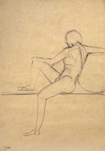
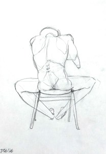
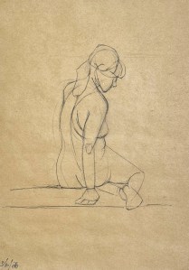
The drawings posted here then are 15 minute studies. They are purely linear studies. It takes me all that time just to get a coherent design down. If and when I can speed up, shading (which I do love), can be added. But why add on the window dressings if you haven’t built the house right?