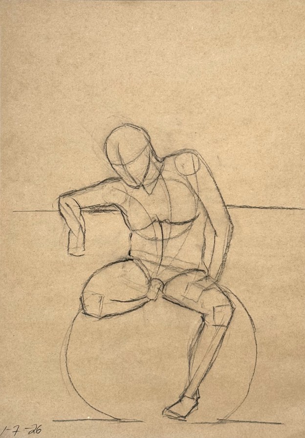
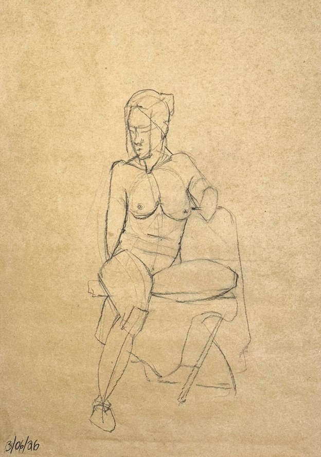
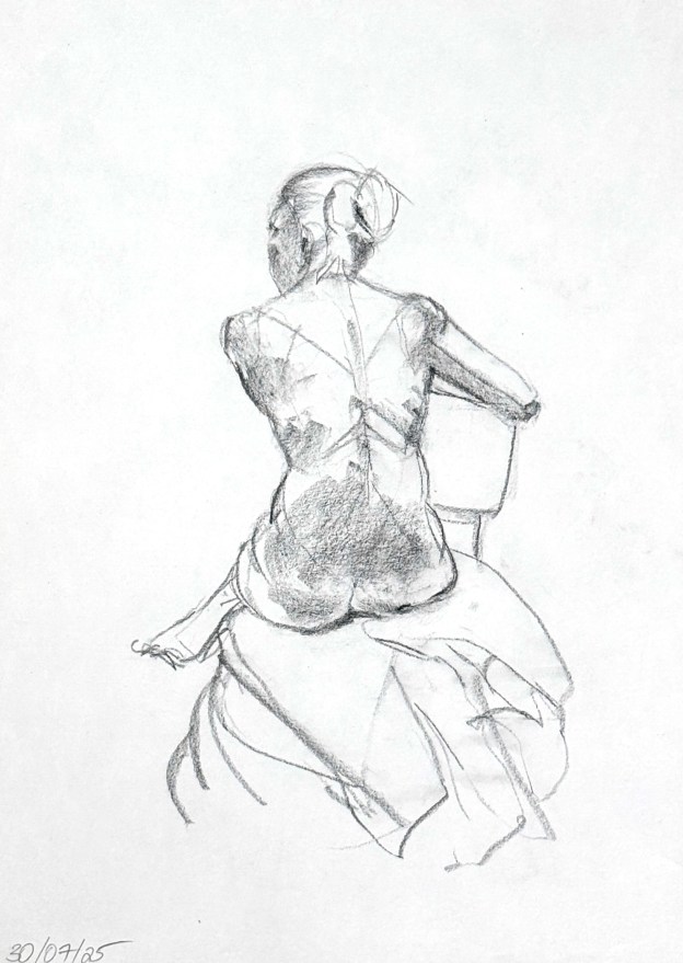
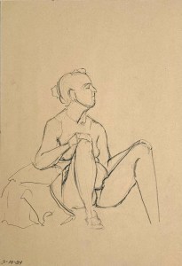
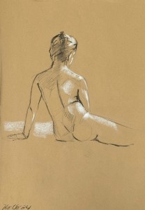
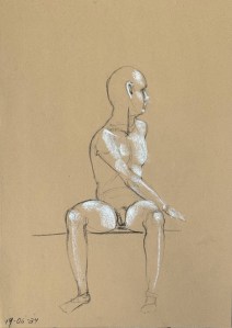
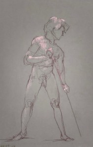
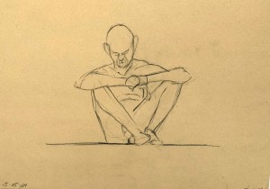
Fifteen minute figure study. Charcoal pencil on toned recycling paper. 35 x 50 cm
After a looong hiatus from Bruges but also from live figure drawing, I’m very happy to be back. During this particular interim I’ve been concentrating on studying the anatomy of the human figure: bones (skeletal), muscles, tendons, ligaments; but also differing schemes for abstracting figurative essentials in an accurate way. Mostly, these studies were done at the Watts Atelier in Encinitas, California – and most were done by using photo references from books. Tedious, perhaps. Uninspiring, well, yes; so you just had to supply your own. Which I did.

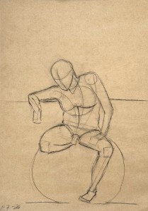
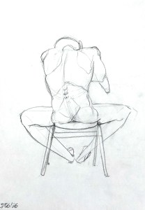
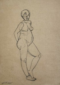
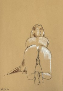
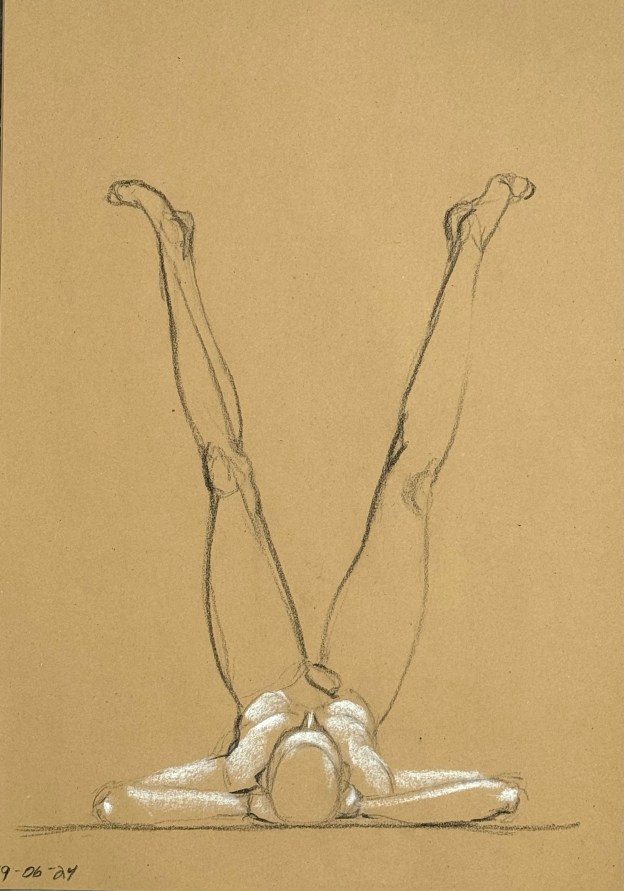
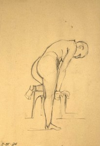
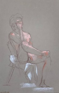
Fifteen minute figure study. Charcoal pencil on toned recycling paper. 35 x 50 cm
My own inspiration then, my own questions, after drawing from the figure on and off for about forty years, were and are very specific. I have or have had no difficulty feeling the figure or expressing my feelings on paper but I certainly have noticed that I don’t always get the proportions right and, relative to anatomy, I have felt myself to be quite ignorant. In the world of Modern/Contemporary Art, neither of those things are a problem so long as you say something “personal” and that was what I was taught back in the day at my liberal-arts-college art department. Personal distortion is more or less expected. But there, for whatever reason, my temperament begs to differ: I feel awkward if things are off while my body tells me with a distinct sense of relaxation when I get it right.

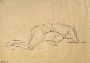
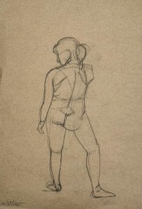
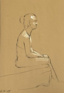
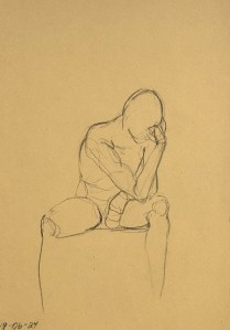
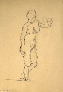
Fifteen minute figure study. Charcoal pencil on toned recycling paper. 35 x 50 cm
Descending into these “left-brained” studies then has been deeply frustrating. I’ve had to retrain the dog so that, at least temporarily, I became ignorant and uncoordinated. My movements were slower and unsure, as analysis replaced intuition. My drawings were incoherent. Some instructors assured us that there was light at the end of the tunnel. I certainly hoped so. The good news was that I was instructed to use cheap and simple charcoal pencils. Nothing fancy or expensive, so any attempt was easy to throw away, but also no high-end crutch to rely upon. 😉
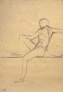
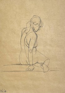
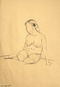
Fifteen minute figure study. Charcoal pencil on toned recycling paper. 35 x 50 cm
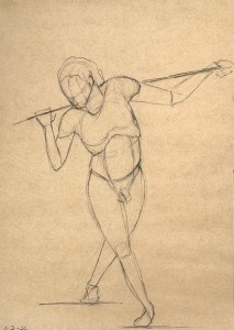
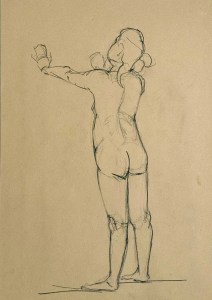
So here tonight, after returning to Brugge, I can feel and see some progress being made. My three minute gestures are currently trash (I am still moving too slowly) but all of the fifteen minute studies were “keepers”. Before I began my studies my batting average was maybe 50%? So my proportions are improving and I experienced great joy in discovering the various skeletal protrusions I had studied. Even the final pose of the night, a five minute energetically expansive one, fell into place quite quickly. Ha!
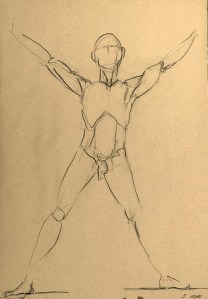
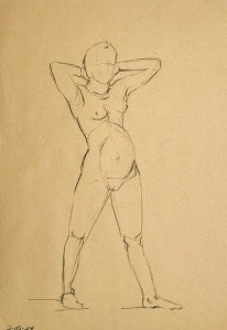
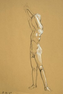
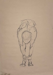
Five minute gesture study. Charcoal pencil on toned recycling paper. 35 x 50 cm.
I can imagine that over time I will be able to return to the chiaroscuro I used to enjoy so much. That is, placing highlights and shadows quickly – but accurately. For now though, placement on the page with proportional and gestural accuracy is improving so I’m happy.