Tag Archives: Ellen Cathcart Trezevant

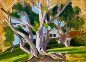
The six trunked Coral Tree. December 2025. Oil on panel. 9.5 x12' oe 21 x 32 cm.

The six branched Coral Tree, December 2025

The six trunked Coral Tree. December 2025. Oil on panel. 9.5 x12' oe 21 x 32 cm.
The six trunked Coral Tree. December 2025. Oil on panel. 9.5 x12′ oe 21 x 32 cm.

I went out last Saturday afternoon to see if I could rescue a painting that been stuck. I had done all my underdrawing and underpainting in November (in three or four sessions), but felt as though I didn’t know exactly how to resolve various issues: painting wiry trees in Southern California, with a new-to-me palette of colors.

In the mean time, I had found relative success by painting the tree next to it. Its form was simpler to grasp. It’s gesture, too. When you spend a few hours on location in each session, noticing how the light falls as the afternoon progresses, seeing how the shadows group as they define the foliage, you build an internal image repository of what it is you want to say. That light, there. Even though no particular stroke can ever define it: the effect is cumulative.

So I decided to retry the first tree. It has six main trunks or branches which intertwine, and it’s not always possible to see what is what. But if–as the artist–you know what is what, then you can place a spontaneous splotch of light accurately. If not, then not.

So I had already done my homework, the question was whether I could breathe some life into my ugly duckling. A palette of cadmium orange, titanium, ultramarine blue, cadmium red, cadmium yellow light and raw umber did the trick. Four bright colors earthed by umber, lightened with a strong titanium white, as needed.

I’m happy.

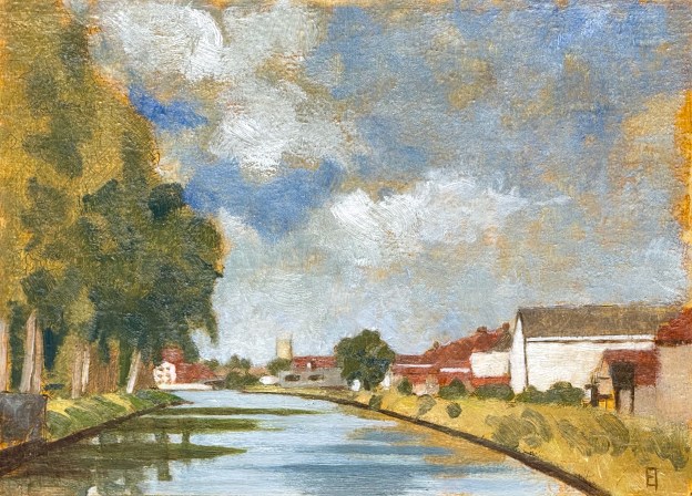
Langs de Vaartdijk II. Oil on panel. September 2025. 9 x 12.5" or 23 x 32 cm.

Langs de Vaartdijk II, September 2025

Langs de Vaartdijk II. Oil on panel. September 2025. 9 x 12.5" or 23 x 32 cm.
Langs de Vaartdijk II. Oil on panel. September 2025. 9 x 12.5″ or 23 x 32 cm.

It’s early September, the last days of summer are upon us. I went out last Sunday, prospecting for a new painting, and ended up choosing this scene along the Vaartdijk, looking back towards Brugge. I had already done one along this canal about ten years ago, different location, different view. In this scene you can just see the tower of the Gentpoorte rising in the distance, a little to the left of center.

I set up with my chair, paintbox and tripod, situated upon a dijk, rising to the left of the bicycle path. It was about four feet wide. I knew: any wrong move would land me in the water, swimming around with the little duckies. (Didn’t happen, but could have been refreshing if it did.)

I spent about three hours sketching in the scene using silverpoint, until I began inking it in with my black pen nibs. After a few lines, both pens dried out(!). Yes, it was a 30 degree centigrade day out there, but still, maybe time to buy some new ones? So I closed up shop and replaced them the following day. I completed my B/W drawing at home, anticipating going out as soon as possible to render the scene in oil en plein air.

The weather on Tuesday was clear enough and warm enough to give it a shot. As I worked, the shadows lengthened, making the reflections in the water more and more and more interesting. By five pm, as I packed up, I knew how I wanted to handle the water but also knew that it would have to wait until its painted surface had dried enough to do what I felt was still needed.

I ended up using five pigments plus white for this one: ultramarine blue, raw umber, yellow ochre, cadmium yellow light, plus cadmium orange. I used bristle brushes to block in my underpainting and sables to render the details. I made the wished for changes to the water yesterday, which means that I can post this today, chalking up yet one more for this summer season in Bruges. I love singing its praises.

If you are interested in hanging this on your wall, please contact me.

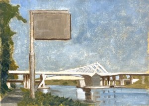
Afternoon light on the A11 bridge over the Zeebrugge Canal. September 2025 Oil on panel. 9 x 12.5' or 23 x 32 cm.

Afternoon light on the A11 bridge over the Zeebrugge Canal

We’ve ridden our bikes up to Lissewege a few times this summer. Every time we turn north onto the Zeebrugge canal, I’ve been struck by the span of a big, white bridge, just as the canal widens towards the sea. So even though it’s a half hour bike ride from home, last Monday I decided to try my luck in capturing it.

Study for the A11 bridge over the Zeebrugge Canal. September 2025  Silverpoint and India ink on gessoed panel.  9 x 12.5' or 23 x 32 cm.
Study for the A11 bridge over the Zeebrugge Canal. September 2025 Silverpoint and India ink on gessoed panel. 9 x 12.5′ or 23 x 32 cm.

I biked out on a sunny day and spent about four hours getting down a relatively detailed drawing – directly onto my gessoed panel. I moved through the free sketch of a charcoal pencil, to the more decisive silverpoint nib and finally committed myself to a finished design using India ink. By that point it was both a composition and a value study. When you spend four hours on location, studying shapes and light, you learn to read the three dimensionality of the scene before you, so that whatever values you end up placing there need to tell that story. See image to the left.

Friday the forecast was for warm and clear skies. I decided to go out. I also wanted to test out my new $$ tripod(!). Its connection to the bracket on the underside of my painting box was solid (no more wobbles) plus the legs themselves were very sturdy. Worth the upgrade (but I do need to sell more paintings to cover that expense! 😉 ).

Afternoon light on the A11 bridge over the Zeebrugge Canal. September 2025 Oil on panel. 9 x 12.5' or 23 x 32 cm.
A11 bridge over the Zeebrugge Canal. September 2025 Oil on panel. 9 x 12.5′ or 23 x 32 cm.

I spent another four hours laying in color, moving through a lean, mid-value underpainting to the definitive highlights and shadows of the final piece you see here. The strong white values of the central bridge dominate the composition while the interstices of the upper supports were defo an exercise for MC Escher himself (!). I couldn’t have rendered them in white paint without having already done my homework in the preparatory drawing stage. Despite their long horizontal slants the (two) bridges balance out compositionally by the path and the water. I like it.

As it turns out, I worked with a limited palette: lead white, yellow ochre, cadmium yellow light, raw umber and ultramarine blue. That’s it! Whenever possible it is good to work with a limited palette, it reduces the choices plus assists in creating a visual harmony. In the end, a success. A completed painting – and yes, in just one session. That’s the third one of this season: hooray! I might finally be on to something. 😉

If you are interested in hanging this on your wall, please contact me.

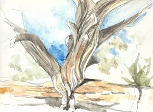
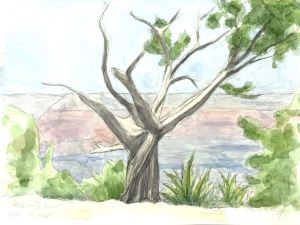
Tree @ Hermit's Rest. Watercolor. May 5, 2025 9 x 12" or 23 31 cm.

Tree @ Hermit’s Rest, May 7 2025

Tree @ Hermit's Rest. Watercolor. May 5, 2025 9 x 12" or 23 31 cm.
Tree @ Hermit’s Rest. Watercolor. May 5, 2025 9 x 12″ or 23 31 cm.

From El Tovar we biked out to the western edge of the South Rim of the Grand Canyon. Because of the scenery it’s one of the most amazing bike rides I’ve ever experienced. We arrived at Hermit’s Rest cold, wet, and happy – especially because of the hot drinks available there. Later outside, while having lunch, I spotted this lone tree standing like a sentinel over the canyon. Fantastic. My husband agreed to hike around for a half hour so that I could get down a quick sketch.

Once again, I pulled out my handy-dandy little easel box and (once again) found I could use my full arm with the charcoal pencil to sketch in a quick design. The gesture of the tree was so compelling, especially before its background of eternity. After my half hour, I felt lucky to have created a good start but, time-wise had no chance to do a watercolor. I snapped a photo of the dramatic lighting on the tree, hoping I might be able to complete it later.

Watercolor as a medium, is demanding because the paper provides the strongest whitest light, so it is critical to know what not to paint before you begin painting. If you don’t make those important decisions up front, you end up with mud. So, once we were back home I had an enjoyable afternoon laying in light background washes and then attempted to sculpt that tree. The lights and shadows tell its story. I’m pretty happy with the result.

If you are interested in this piece shoot me an email.

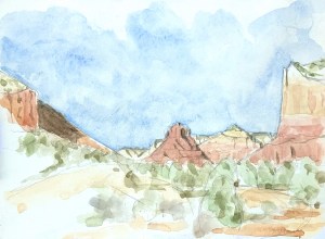
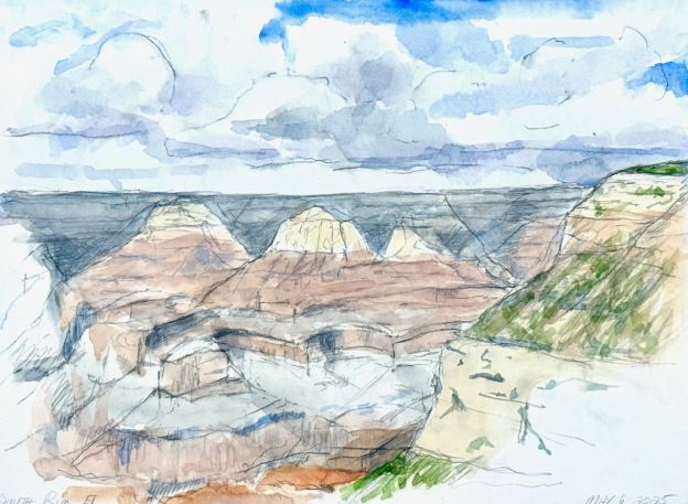
Afternoon Vista from the Grand Canyon's SouthRim. Watercolor. May 5, 2025 9 x 12" or 23 31 cm.

South Rim Vista @ the Grand Canyon, May 6th 2025

Afternoon Vista from the Grand Canyon's SouthRim. Watercolor. May 6, 2025 9 x 12" or 23 31 cm.
Afternoon Vista from the Grand Canyon’s SouthRim. Watercolor. May 6, 2025 9 x 12″ or 23 31 cm.

We visited the Grand Canyon at the beginning of May. It was my first time there. Ever. Jaw dropping awe barely describes it. Actually, after leaving the car and taking in the view, I wept. (It could have easily been the travel fatigue but the overwhelming shock of it is no joke.)

The weather was cloudy, then rainy, then cloudy again but finally on the afternoon of the 6th, clear. I had a few hours free, so I grabbed my handy-dandy watercolor box and headed to the rim.

After a brief reconnaissance I found a good spot with some foreground interest to help establish scale so I set up and got to work. Principally, by creating this small travelling easel, I was now able to use my arm instead of my hand to draw. That makes a huge difference!!! And since I have been learning how to use a charcoal pencil for figure drawing at the Watts Atelier, I decided to use that for my initial sketch (in contrast to a graphite pencil which I have been using). The charcoal makes quick dark lines. Perhaps too quick and too dark but I was already on my way and decided to bugger through. After creating a design of the shapes before me I felt ready to begin laying in washes. The charcoal made the colors too muddy, too soon, so I had to improvise.

I had about an hour to try to capture the scene before me. The light kept changing so that meant the layout of the strata was also constantly changing: hidden, then revealed, then hidden again. Given all the challenges of the terrain and my ongoing experiments with the tools of the trade I’m grateful to have come up with something at all. I did snap a photo reference for later touch ups, but strangely enough, didn’t need to consult it much after we got home. A small half hour of tightening up was all that was needed.

If you are interested in this piece shoot me an email.

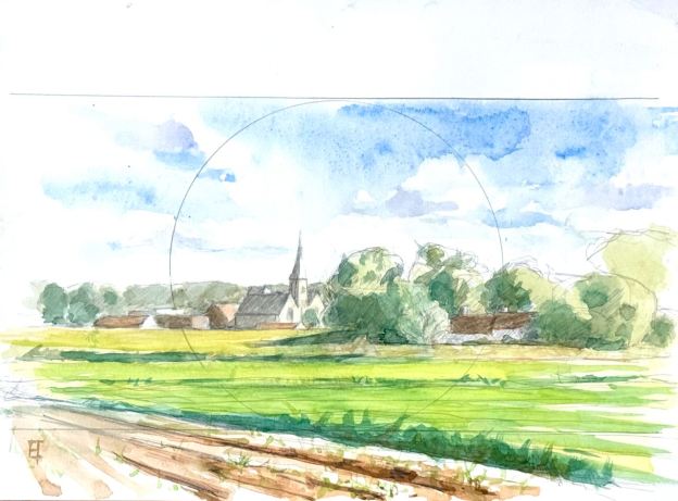
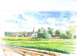
Watercolor of Koolkerke, Belgium. 23 x 31 cm or 9" x 12".

Koolkerke Watercolor, September 2024

Watercolor of Koolkerke, Belgium. 23 x 31 cm or 9" x 12".
Watercolor of Koolkerke, Belgium. 23 x 31 cm or 9″ x 12″.

Late in the summer en-plein-air season I discovered this view of the church at Koolkerke near Bruges. I had just designed a new traveling pochade box, exclusively for watercolors, so I was happy to try it out in this new-to-me location. Two birds. One stone.

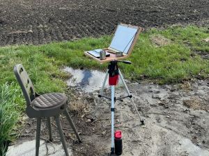
The box worked out well enough, though I always can’t help but tweak a few things. My interest was in having a sturdy but lightweight box that could exactly fit a standard watercolor block within its lid. Check. Piano hinges gave me a good easel angle. For the inside of the palette base I attached adhesive magnetic discs so my metallic watercolor pan and pots would stay put and not fall over. Underneath I attached a bracket that would take a 1/4″ 20 thread standard camera tripod mount. Check. Everything fit into my bike bag. Check, check, check. The only problem was the lateness of the season: it was very cold!

Pochade box for watercolors attached to a camera tripod.

Still, I was able to manage a session or two, enough to lay in this watercolor as a study for an oil next summer. I really love the afternoon light playing on the buildings in the far middle ground. Luckily the farmer’s fields in the foreground gave me something to work with compositionally. As a study I’m happy and have my fingers crossed for next summer.

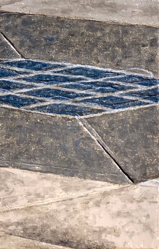
A Piece of Me #40, oil over collage on panel. 21 13.3 cm or 5 1/4 x 8 1/4 in.

A Piece of Me #40, oils

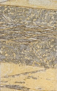
A Piece of Me #40, underdrawing over collage.

A Piece of Me #40, underdrawing over collage.

A Piece of Me #40, oil over collage on panel. 21 13.3 cm or 5 1/4 x 8 1/4 in.

A Piece of Me #40, oil over collage on panel. 21 13.3 cm or 5 1/4 x 8 1/4 in.

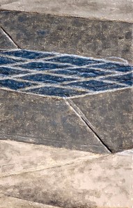
This panel had some particular challenges to it, both of which were my own creation. The first problem came from the lack of alignment of my collaged panel (created more than one year ago during the preparation phase) to my black and white transposed design. Although (I thought) I had used the same transfer process, my alignment was off by a few millimetres. Well, OK, I’ll live with that, knowing the texture of oil paint can mask things to a certain degree and also that I’m open to whatever happens in this multimedia process of creation. The only real accidents are lack of adhesion or longevity.

The second problem occurred with the absorbency of the black paint tinted underdrawing. Even after three or four days, it’s adhesion to the ground appeared to be insufficient. Parts of it came off when I used my kneaded eraser to erase the charcoal transfer lines (it was too heavily diluted). Since it’s an underdrawing this too is not a fatal error. Nevertheless I did go into this one with some caution, not sure I would be able to salvage it.

The photograph of the completed panel above left is side lit, so the textural pentementi of the misaligned collage are visible. Those (misaligned) highlights are visually fugitive so they don’t really bother me. Additionally, the lighter-than-I would-wish-for underdrawing did not pose a huge threat, either. I compensated by drawing in the white grouting lines for the blue tiles with white lead paint as an underpainting and let it dry. After a few days I was good to go. Thus, in this piece (and the whole project) I am not out to create perfection, but rather, a visually and tactilely attractive assemblage that ultimately will invite the viewer to unify for themselves. And hopefully experience aesthetic pleasure in doing so!

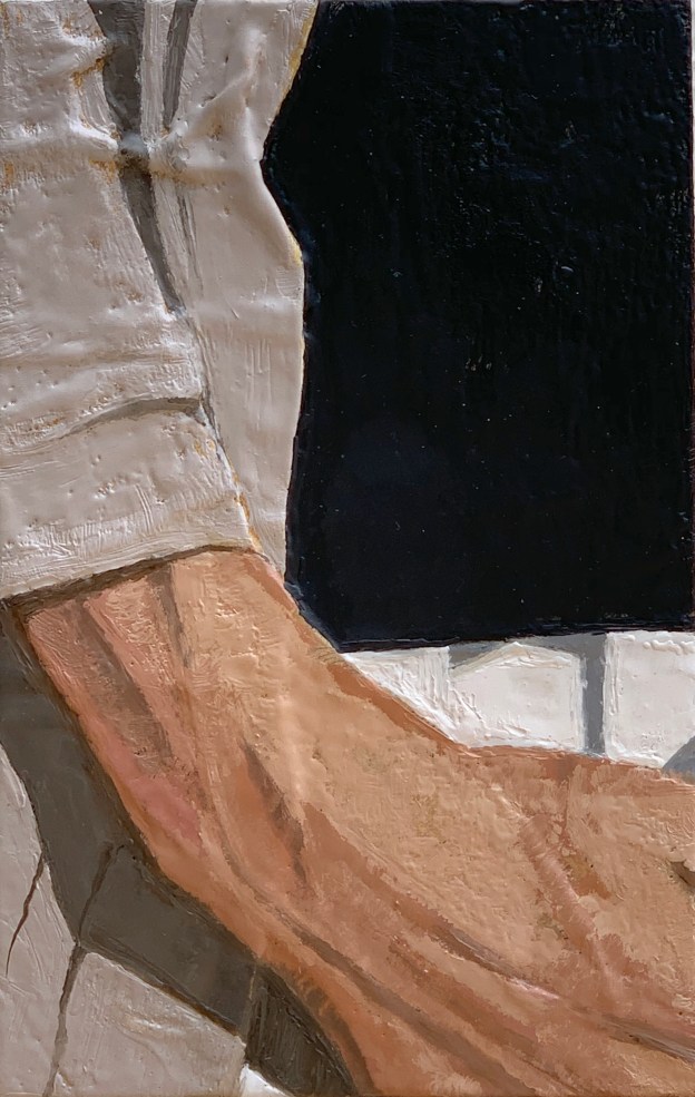
A Piece of Me #28, encaustic over collage on panel. 21 x 13.3 cm or 5 1/4 x 8 1/4 in.

A Piece of Me #28, encaustic

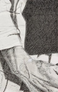
A Piece of Me #28, underdrawing in pen and ink.

A Piece of Me #28, underdrawing in pen and ink.

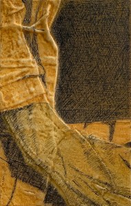
A Piece of Me #28, imprimatura and underpainting.

A Piece of Me #28, imprimatura and underpainting.

This is/was such an interesting panel to do! The design call-out for it was collage and encaustic. Two very textural and graphic media. You put the two together and the effect can be exponential. On top of that, it was a strong composition: strong contrasts of black (shirt) and white (pants). Gestural elements of a wavy linen coat flowing into a resting but sculpted hand. I enjoyed the result at each step along the way. The finished collage was enticing (no photo of that); the underdrawing phase, too (see above, left). I could almost feel that hand. Well, of course I could since it’s mine, still it was being objectified in black and white. So from the beginning his particular panel reinforced my goal for the overall project, I want it to speak viscerally to the viewer.

To begin the encaustic phase I laid in a coat of yellow ochre and proceeded to melt it back off. This had the effect of unifying everything in a golden imprimatura glow. Unsurprisingly the melt off accentuated the textures of the collage, creating white ridges. See the side-lit photograph above, right.  Then I painted a green tone to the skin and melted it back off, too. Again, see the hand in the photo above, right. This concluded my prep.

A Piece of Me #28, encaustic over collage on panel. 21 x 13.3 cm or 5 1/4 x 8 1/4 in.

A Piece of Me #28, encaustic over collage on panel. 21 x 13.3 cm or 5 1/4 x 8 1/4 in.

With the exception of the skin tone, the black shirt, white pants and linen jacket went quickly and were pretty straightforward. That was because so much textural variation had already been built into the under layers. However, achieving a variegated chiaroscuro skin tone of the hand in encaustic was more difficult than one might imagine. I opted for creating a sculpted, veined hand in variants of warm and cool tonalities. The result reads well enough for my purposes. Though I must say I had increased respect for those Fayum mummy painters of old.

Somewhat surprisingly, the biggest challenge arrived in the “burning-in” phase. This phase happens when you have completed your painting but you still need to rewarm/remelt the whole surface in order to fuse the paint to the panel. I use a hand held heating lamp for this step. However, because it is a collage, the surface is heavily sculpted: it is not flat. The wax melted and pooled in ways “retrograde to my desire”. Edges blurred. Contrasts merged. So I had some clean up to do after the burn-in. No problem, a small scraping tool along with the little encaustic pen (with its drawing and painting attachments) could be pressed into service. Once completed, I was ready to hang up my guns and call it a day (or two).

Technical write up of using encaustic for an indirect painting technique here.

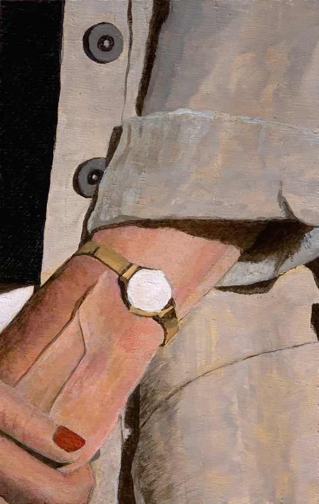
A Piece of Me #26, acrylic on panel. 21 13.3 cm or 5 1/4 x 8 1/4 in.

A Piece of Me #29, acrylics

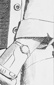
A Piece of Me #26, underdrawing in pen and ink.

A Piece of Me #26, underdrawing in pen and ink.

A Piece of Me #26, acrylic on panel. 21 13.3 cm or 5 1/4 x 8 1/4 in.

A Piece of Me #26, acrylic on panel. 21 x 13.3 cm or 5 1/4 x 8 1/4 in.

This panel presented an interesting contrast of values and hues. Strong black shirt and effects of light and shadow contrasted to a muted linen jacket and nuanced flesh tones. Additionally, the panel was untreated. I am coming to recognise this treatment (or lack thereof) presents a particular challenge to the painter. The paint is simply more difficult to manipulate.

Given all that I am pleased with the outcome. The jacket undulates, the shadows read, the flesh pulses. I wonder what time it is on that watch?

Overview of the entire project here. Technical write up of my use of acrylics for indirect painting in this project here.

A Piece of Me #09, acrylic on panel. 21 x 13.3 cm or 5 1/4 x 8 1/4 in.

A Piece of Me #09, acrylics

A Piece of Me #09, underdrawing in pen and ink

A Piece of Me #09, underdrawing in pen and ink

A Piece of Me #09, acrylic on panel. 21 x 13.3 cm or 5 1/4 x 8 1/4 in.

A Piece of Me #09, acrylic on panel. 21 x 13.3 cm or 5 1/4 x 8 1/4 in.

Moving into the figurative pieces now especially those with serious flesh tones. This composition was mostly sweater, a little shirt and a piece of neck.

The approach called for an un treated panel (so no cotton or linen glued to the substrate to soften the blow). That meant that the strokes would speak for themselves and also would be a little slow in drying. If you take that into account, no problem, but if you try to work too fast (which I did) you can experience “holes” where the paint suddenly lifts off the surface whenever you work back over it. So this happened today while working on the man’s neck. The paint lifted off revealing two green blotchy holes (exposing the underpainting) in the highlighted area. Ha! I had to just stop and take a break. An hour later the surface was dry enough that I could stipple in a patch to match. This evened it all back up. No problem.

Nevertheless, the skin tone itself was a success story of indirect painting. I laid a green toned underpainting over the yellow ochre imprimatura. Then I mixed up three tints of venetian red (the Renaissance painters called that sinopia) to develop the form. When that work dried, I sponged in a yellow ochre glaze. Pop! Yummy flesh.

Another fun challenge was the sweater. I wanted to give it some movement as well as indicate the chiaroscuro of the body form beneath it. The underdrawing already indicated some movement, so I tried to let it speak though my strokes. After I was done working in the large forms and movements, I adjusted the colour with a sponged in glaze of cadmium yellow (bright!). That turned it from an almost dark-olive grey to a bright, delicious green. I’m pretty happy with the way it all turned out.

I might not want to eat that sweater but I wouldn’t mind a quick snuggle.

Overview of the entire project here. Technical write up of my use of acrylics for indirect painting in this project here.