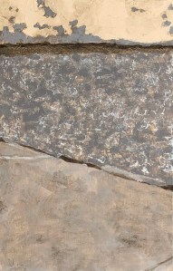
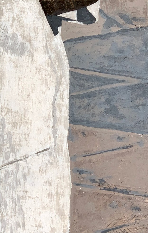
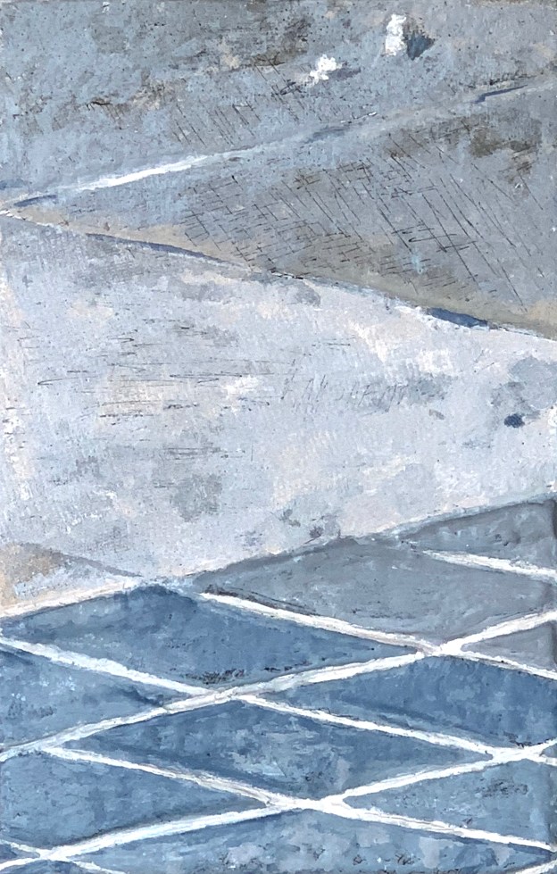
Fifth in the acrylic series. An abstract composition of floor tiles. The painting was executed over a collage that already reflected the design of the panel.
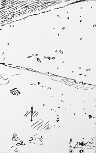
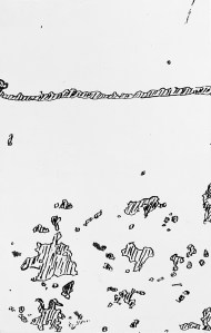
A Piece of Me #64 pen and ink underdrawing.
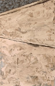
A Piece of Me #64, acrylic over collage on panel. 21 x 13.3 cm or 5 1/4 x 8 1/4 in.
My palette consisted of titanium white, medium grey, yellow ochre, burnt sienna and raw umber. I used lots of extra tools to assist in creating texture: a coarse sponge (large and small chunks of it), the painting knife and a piece of paper towel (to soak large areas of wash off the lighter tiles).
One of the most enjoyable aspects of doing these panels is that because they are bite-size (basically the size of an A5 or half of 8 1/2 by 11 U.S. letter), each one can be an open experiment in terms of execution. I can create a small unity using a variety of means. This would not be possible if the panel was, say 8 feet by 10 feet. If that were so I would have had to devise special brushes or sponges on wheels and pulleys. The scale then makes this freedom possible. The question then is how the final assemblage will function (also as a unity). But since I’ve done this before I’m not really worried – just curious.
Technical write up of my use of acrylics for indirect painting in this project here.