Category Archives: Watercolors

Benisanó, view of the Castle from the terrace, noon. Watercolor on hot pressed paper. 9 x 12" or 23 x 30.5 cm. September 2023.

Postcards from Benisanó

Benisanó, view of the Catholic church, morning light. Watercolor on hot pressed paper. 9 x 12" or  23 x 30.5 cm. September 2023.

Benisanó, view of the Catholic church, morning light. Watercolor on hot pressed paper. 9 x 12″ or 23 x 30.5 cm. September 2023. SOLD

We recently returned home from a road trip to Spain where we visited with friends of ours who live in Benisanó, a small village outside of Valencia. I had brought my watercolours with me, imagining I would have lots time to create images of the places we visited along the way. That didn’t really turn out to be the case, because traveling is its own adventure which certainly has its own demands.

However during the five days we visited with our friends, I did have plenty of leisure time to capture views of their environment. In particular, from the upstairs back terrace of their house I found great views of the Catholic church as well as the Medieval castle. Both are very beautiful when illuminated at night – but also in the morning.

Benisanó, view of the Castle from the west, late afternoon light. Watercolor on hot pressed paper. 9 x 12" or  23 x 30.5 cm. September 2023.

Benisanó, view of the Castle from the west, late afternoon light. Watercolor on hot pressed paper. 9 x 12″ or 23 x 30.5 cm. September 2023. SOLD

For the church, I chose a composition (of buildings, vegetation and light) which peaked at about 10:00 a.m.; while for the Castle, I found a similar composition but which peaked at about noon. So while most everyone was still sleeping (it was Spanish time) I sipped my tea and created value studies of these two different scenes. In addition, I biked over to a field on the other side of the Castle and tried out a quick study of that perspective, too. Luckily, I had a few watercolour blocks with me so I could switch from one to the other without tearing off the page. (Blocks which are glued on all four sides allow for working wet-in-wet while still drying out flat. That’s important!)

Benisanó, view of the Castle from the terrace, noon. Watercolor on hot pressed paper. 9 x 12" or  23 x 30.5 cm. September 2023.

Benisanó, view of the Castle from the terrace, noon. Watercolor on hot pressed paper. 9 x 12″ or 23 x 30.5 cm. September 2023. SOLD

I was able to finish the Catholic-church-terrace piece while there but the Castle-terrace one had to wait until we returned home. In both cases I did the value study from the patio, while snapping photos of the light I wanted to capture. As I continue to develop my own process, I am no longer hesitant to make use of photographs (I used to be terrified of being trapped by their visual dictates!). But what is incredibly important to me still is to feel the immediacy of any particular landscape, what it is saying to me, how I feel about it, how I wish to interpret it. When that stays in the foreground (whether assisted by photos or not) the drawing, watercolour or oil painting usually turns out fine.

So here are my three postcards from Benisanó. The Church (from the terrace), The Castle (from the terrace) and The Castle (from the field).  I think the terrace ones worked out better simply because I had the time to get the compositions right.

All three watercolors have now been sold.

Vivenkapelle watercolour on hot-pressed paper. August 2023. 23 x 31 cm or 9 x 12.5 "

Vivenkapelle, Watercolor

New field easel with painting tray, water cups, hanging brush holders and painting rag. Very uncomfortable folding chair. Customised pochade box (for upcoming wet oils) on the ground.

New field easel with painting tray, water cups, hanging brush holders and painting rag. Very uncomfortable folding chair. Customised pochade box (for preserving the upcoming oils when wet) on the ground. Day pack to the left. Electric bike not pictured. 😉

The weather in August finally turned nice, (July BTW was a disaster), so I headed out to the fields. I had purchased a new light weight field easel – for which I had constructed a small painting tray. I was anxious to test out my new rig. I had remembered experiencing a breath-taking mid-afternoon-light view of a very Belgian chapel somewhere out side of Brugge. But where? So, it took me awhile to find it and then to determine the best spot for a drawing/watercolour. 

I concentrated the first session on getting down an accurate drawing. Weighing the accents of the composition and adjusting to their placement on the page. Feeling the light that I wanted to capture. Took about two hours. I had already determined that I wanted to add in a few cows later, so I snapped a few photos of those meandering munchers.

At home I placed carefully cut pieces of masking tape to save the whites for those creatures before the next session. The second foray consisted of laying in washes of the colour relationships: red tile roofs contrasted to waving trees of green, the organic yet gentle shock of complements to be seen everywhere in Belgium in the summer. Add to that blue skies and long horizontal slashes of yellow corn fields, accented by pops of whitewashed farm buildings. Belgium, what a delight. After another two hours I had the chromatic start that I wanted, but since dinner called, I packed up and went home.

That second session was a nice start but my values were still too light (defo a weakness of mine). In watercolour, the eloquence of the paper needs to be reserved for the highlights and quarter tones. So of course it’s important to preserve them, but their impact only truly resonates by their contrast to well placed shadows. So I headed out for the third and final session – to intensify the saturation of my hues as well as to darken the values in the shadows. Later, back home, I removed my masking tape and drew in those sweet cows, touching them up with watercolour washes. 

Vivenkapelle watercolour on hot-pressed paper. August 2023. 23 x 31 cm or 9 x 12.5 "

Vivenkapelle watercolour on hot-pressed paper. August 2023. 23 x 31 cm or 9 x 12.5 “

I’m happy with this one and feel like I am finally finding my groove(!). Less is always more: saying whatever you want to say with a minimum of means, allowing light, colour, lines, shapes and form to speak for themselves.

In this case, “moo”…


Farm on the Damse Vaart. Watercolour on hot pressed paper. 30 cm x 60 cm. 2023

Farm on the Damse Vaart – watercolour

Farm on the Damse Vaart. Watercolour on hot pressed paper. 30 cm x 60 cm. 2023

Farm on the Damse Vaart. Watercolour on hot pressed paper. 30 cm x 60 cm. 2023

I finally completed this watercolour (online, in the spotlight above and to the left in the email) which I began about ten years ago en plein air. It had always been intended as a study for an oil, so even though at the time it was quite light in tonality (see small image here to the right), I felt that I had what I needed for the oil. I laid the watercolour to one side and commenced with the oil (in the studio). But the oil, too, ended up getting interrupted by my years of studying philosophy @ KULeuven. I completed the oil then in 2019. All this time the watercolor languished.

original watercolor of a farm on the Dammevaart 2014

original watercolor study of a farm on the Dammevaart 2014

I liked it, but at the same time, felt it to be insufficient, incomplete. Both projects then stretching out over such long periods of time would seem to indicate a lack of interest/passion on my part. But that was not the case, mostly, it was simply frustration. Frustration with my skill to convey what I felt about that particular scene. It’s a group of farm buildings to the right of the Damse Vaart as you head out of town (from Brugge towards Damme). At about three in the afternoon, on a summer’s day the light plays so beautifully.

As a composition it’s a long horizontal landscape. The main attraction is the farm buildings in the middle-ground. Also, as a composition, the line of trees in the far distance present no problem. The visual challenge lay in the foreground: there was a large field of green pasture, out of which I wanted to extract some interest, leading the viewer in. I did locate a diagonal line there which I exploited, and in the oil, scattered in a few grazing cows. Still, to my eye the watercolour remained too light and insufficient.

Fast forward to last summer, as well as this one. I have found that imposing a circle in the centre of a watercoloured landscape can be helpful. It may or may not end up being visible in the final painting: doesn’t matter. For me, it helps to focus the elements without being formulaic, though last summer it defo veered in that direction. So I decided to try something like that with this one. I truly felt I had noting to lose: improve it or toss.

The result is, I think, an improvement. Also I kept in some pencil lines. To me they don’t detract. What do you think?


aan de jacht haven Brugge/ the marina in Bruges. Watercolor on hot pressed paper. 9" x 12" or 23 x 30 cm.

avond aan de Jachthaven/ evening at the marina

aan de jacht haven Brugge/ the marina in Bruges. Watercolor on hot pressed paper. 9" x 12" or 23 x 30 cm.

aan de jacht haven Brugge/ the marina in Bruges. Watercolor on hot pressed paper. 9″ x 12″ or 23 x 30 cm.

Most of this drawing/watercolor was done en plein air, but in two sessions. First the drawing. I really like spending time getting the forms: the movement, the proportionality, the composition, right. Light and shade play a role in this but if the composition is too dependent upon the play of light, that light will be gone before I can get pencil or brush to paper. Too much changing light. Vague composition. Vague statement.

So I like to spend time with a chosen spot, feel the impulses as they present themselves, feel the shapes, the play of light, feel nature whispering and dancing through the trees while the ducks quack. And because the project is en plein air, as I’m exposed to such changes, I’m making choices.

I snap various photos along the way. One of them will capture the light I’m now intending.

the equipment of an en plein air painter

the equipment of an en plein air painter

At home I refine the edges of my proposed fields of colour, and at the next (and final) session I lay in my washes. Working wet-in-wet in nature is tricky, it’s much easier to control at home, so I’m still getting the hang of it. As for the en plein air equipment: I had a very funky tripod-converted-to-a-drawing easel along with a tri-legged folding stool all of which strap to the back of my bike. It makes exploration and discovery a whole lot easier. (Thankfully the tripod part has since been upgraded 😉 ). In any case, the image here above is what I came up with.

And now, time to move on to the next…

Schaarstraatbrug, Right. Watercolor on hot pressed paper. July 2, 2023. 9 x 12" or 23 x 30.5 cm

de Coupurebrug, Right, July 2, 2023

Coupurebrug, Right. Watercolor on hot pressed paper. July 2, 2033. 9 x 12" or 23 x 30.5 cm

Coupurebrug, Right. Watercolor on hot pressed paper. July 2, 2033. 9 x 12″ or 23 x 30.5 cm  SOLD

After creating a watercolor of the view to the left from the Coupurebrug, I decided to create its companion piece, the view to the right.

Pictured here is a watercolour created in three stages: first an on site drawing, capturing the composition, proportions, viewpoint and conditions of light. It was done late morning on a very calm, sunny day. Perfect. I snapped a few photos for backup and went home. Soon, the weather turned windy, rainy and cold, so I decided to work from my photos for my beginning washes.

Some exciting stuff began to happen, particularly in the sky – which had been cloudless but suddenly had clouds. Fine, I’ll take that. Things continued this way until I had something I really liked but also knew it was unfinished.

I waited until a morning presented itself in which the light was good. Principally, I wanted to be on site again, feel what I feel and make the final choices principally to punch up the foreground. Today presented itself as a possibility. I rushed out for a quick session. The wind was very active and blew my stuff around. No matter. I got what I wanted, so this is the finished piece.

Both watercolours are for sale. $100 each, unmatted, unframed. Shipped anywhere for an additional $30 (approximately). Proceeds go the the Vrienden der Blinden.

Coupurebrug, Left. Watercolor on hot pressed paper. June 15, 2033. 9 x 12" or 23 x 30.5 cm

de Coupurebrug, Left, June 15, 2023

Coupurebrug, Left. Watercolor on hot pressed paper. June 15, 2033. 9 x 12" or 23 x 30.5 cm

Coupurebrug, Left. Watercolor on hot pressed paper. June 15, 2033. 9 x 12″ or 23 x 30.5 cm

Our trip to Australia re-whet my whistle for exploring landscape using watercolour. I had begun re-exploring watercolour a bit last summer in the studio, but otherwise, it’s been awhile.

So on returning to Bruges, my thirst has been excentuated by the height of the summer solstice. Here, the days are long and warm, the nights are even longer. The effects of sunlight playing over the flat land with its canals, paths, bridges, trees and fields leads to endless sources of delight.

As I explore, I find I am refining my taste in tools and working methods. For example, I consistently find myself choosing a hot-pressed satin-finished paper in contrast to cold-pressed textured ones. Art shops these days stock mostly cold-pressed paper; it appears to be in style? I’m thinking that’s because spontaneous brush strokes, evoking grand abstracted images do very well on such a surface. But for me, because I enjoy rendering the fine details of a light soaked landscape, hot pressed paper wins. Hands down.

Then there’s the wcblocks themselves. Watercolor pads can be glued down on one side only, resulting in curving and buckling when the paper gets wet. Again, that may be OK for quick, vital brush strokes on cold pressed paper, but hot-pressed paper possesses not only the capacity to render fine detail, it also possesses the capacity to receive multiple washes. It’s important, especially when working wet-in-wet, to avoid that buckling, if possible. Buying watercolour blocks that are already glued down on all four sides instead of “pads” glued on just one side is yet another fine point.

The landscape imaged here is an early summer’s evening over the Coupure. It’s from a bridge near to our house. I pass by almost every day and have noticed that looking right (see watercolor created a few weeks later) or left are equally exciting, depending on the time of day and conditions of light. So I finally took my pad and pencils out last week to capture the composition seen here. I knew from experience, that the boat arrangement along the canal changes every day, so in that first session I spent time getting down a realistic drawing, trying to get the proportions right, and feeling the light that I wanted to capture. I took a few photographs so I could finish it in the studio if the boats changed. Sure, enough, when I went back the next day, the arrangement was different, so I finished with my watercolour washes in the studio.

If you want to achieve a subtle sense of light within a realistic motif and in watercolor, as I tend to want to do, it works out better to finish such a painting in the studio. And hot-pressed paper lends itself to that: fine details, multiple washes, gentle refinement. I do enjoy an en plein air approach to painting when the conditions warrant. This just wasn’t one of them.

Northern Australia – a journey in watercolours

My husband and I recently returned home from a month-long sojourn in Australia. Two and one half weeks of that time was spent on a boat exploring some (for the most part) inaccessible sites along northern Australia’s coastline, from Cairns in the east to Broome in the west. It’s a big continent, thus in the process we traversed 2155 nautical miles(!). I had expected there would be opportunities to paint a few watercolours along the way, so I brought the materials to do so with me: thankfully, watercolours pack light.

Here below then are a few of the ones I consider keepers. Many were completed on land en plen air, within the hour or so allowed to me in the schedule of an ongoing journey. A few were completed later on board ship from a photograph. However, in all cases, I was able lay down the composition first, as a reaction to the scene before me. They are listed in chronological order.

Lizard Island. May 15, 2023. Watercolor on cold pressed paper. 6" x 12' or 15 x 30 NFS

Lizard Island. May 15, 2023. Watercolor on cold pressed paper. 6″ x 12′ or 15 x 30 cm. NFS

Lizard Island, a beautiful beach, north of Cairns, where the snorkelling was good! It was my inaugural watercolour of the trip, which turned out relatively well, despite having forgotten to bring a water well and blotting sponge(!!). It is listed NFS because we gave it to a crew member whose birthday turned out to be the following day.


Cape York. May 16, 2023. Watercolor on cold pressed paper. 6" x 12" or 15 x 30 cm

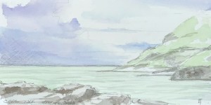
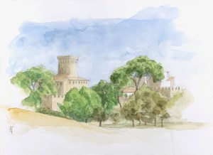
Cape York. May 16, 2023. Watercolor on cold pressed paper. 6″ x 12″ or 15 x 30 cm

Cape York, containing the record of a blustery and overcast day at the northernmost tip of the Australian continent. The sea was strangely opaque with the unearthly colouring of a dull light green. Due to the changing light, sharp rocks and milling shoreside passengers, the painting conditions that day were deeply frustrating. I felt lucky to have gotten anything at all intelligible.

Mornington Island. May 18, 2023. Watercolor on hot pressed paper. 9" x 12' or 23 x 30 cm.

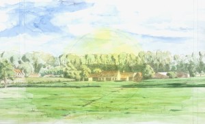
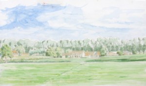
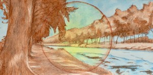
Mornington Island. May 18, 2023. Watercolor on hot pressed paper. 9″ x 12′ or 23 x 30 cm.

Mornington Island, located in the Gulf of Carpenteria. It’s a dry and dusty island hosting a settlement of the Lardil people, one of the original tribes of Northern Australia. They greeted us with their dancing and welcomed us to their art centre, where art is both created and sold. As I walked, returning to the boat, I was struck front-and-centre by this composition of a light green building with its orange tin roof. Thankfully, a crew member took a photo for me (I had forgotten my camera) as we were all herded back to the waiting zodiacs.

Victoria Settlement. May 21, 2023. Watercolor on hot pressed paper. 9" x 12" or 23 x 30 cm.

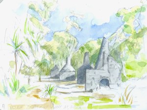
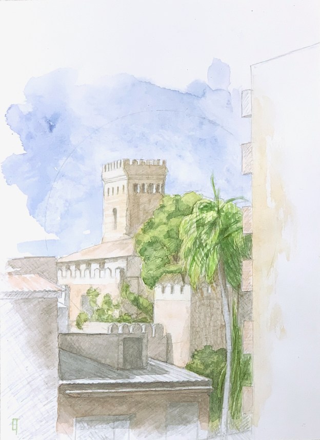
Victoria Settlement. May 21, 2023. Watercolor on hot pressed paper. 9″ x 12″ or 23 x 30 cm.

Victoria Settlement is located on the Cobourg Peninsula. It contains all that remains of an 1838  failed British settlement. Wandering the area I was struck by the symmetrical ruins of the crumbled-and-still-yet-crumbling chimney stacks of the four remaining homes. Perhaps they could have spared themselves the effort? For Shelly had already penned Ozymandias in 1817. But that’s not how ignorance and vanity really work.


Koolama Bay. May 26, 2023. Watercolor on cold pressed paper. 6" x 12" or 15 x 30 cm.

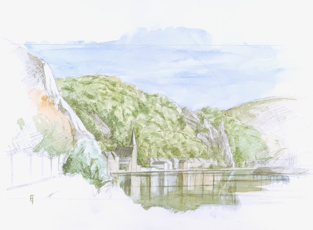
Koolama Bay. May 26, 2023. Watercolor on cold pressed paper. 6″ x 12″ or 15 x 30 cm.

Koolama Bay. We were anchored here one afternoon when I had elected not to join the zodiac boats touring the mangroves (and the crocodiles). The composition noted here moved back and forth into view as the boat swivelled ever so gently on its anchor. The view became more and more spectacular as the setting sun illuminated the sandstone cliffs rising above the turquoise water. Wow! When nature displays its magnificence to us all we can truly do is marvel.

Jar Island. May 27, 2023. Watercolor on hot pressed paper. 9" x 12" or 23 x 30 cm.

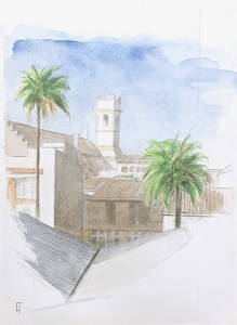
Jar Island. May 27, 2023. Watercolor on hot pressed paper. 9″ x 12″ or 23 x 30 cm. SOLD

Jar Island. We came ashore here one morning. With the others I hiked up a short incline to view the amazing ancient art painted on the cliffs and caves above. Ha!  But there appeared to still be enough time to capture a small watercolor of the shore-scape, or so I thought. After the composition, I was laying in my washes when the crew herded us once again back onto the zodiacs. Had to finish it on board afterwards, though I already had a good idea of where I wanted to go.


Hunter River. May 28, 2023. Watercolor on hot pressed paper. 6" x 12" or 15 x 30

Hunter River. May 28, 2023. Watercolor on hot pressed paper. 6″ x 12″ or 15 x 30 cm.

Hunter River. We were moored here for the afternoon after an exhilarating morning helicopter ride to view Mitchell Falls. It’s a seasonal waterfall, which torrents as one cascade during the rainy season but subsides to a trickle by the end of the dry. We caught it as a series of four – so between effulgence and poverty. For this watercolor on the left, as in Koolama Bay above, the sandstone cliffs of the Kimberley rising out of the turquoise waters were nothing short of magnificent, not to mention the added spotlight of the setting sun.

I hope you enjoy these and yes (except for Lizard Island), they are for sale. Fifty dollars a pop, unmatted, unframed, plus the cost of a mailing tube (say, three dollars) and postage (usually around twenty-five dollars, depending on your location). All proceeds will be donated to our favourite local charity, Vrienden der Blinden (the seeing-eye dog-training facility for West Vlaanderen in Belgium). Please contact me if you are interested. Sizes and locations are noted under each image, so please specify.

Circle, De Lovie, Poperinghe

Arched garden walkway De Lovie. Watercolour on hot pressed paper. Alizarine Crimson and Forest Green. 9" x 12' or 23 x 30 cm.

Arched garden walkway De Lovie. Watercolour on hot pressed paper. Alizarine Crimson and Forest Green. 9″ x 12′ or 23 x 30 cm. SOLD

About a month ago, out near Westvleteren, we stumbled across a large domain called De Lovie (nice name, eh?). The whole area is run by a non-profit organization dedicated to helping children, youths and adults who have mental handicaps. But besides the buildings dedicated to such assistance, a large part of the domain actually contains a beautiful heritage castle, its memorial chapel and landscaping including a lake and English garden. John snapped a photo of the main promenade to the castle with its dappling light. The haloed effect in such a simple, one point perspective piqued my interest, so I decided to try to render it within the circle motif.

The main challenge really was how to render the highlights. In watercolour, this actually doesn’t mean rendering the highlights but rather allowing the white of the paper to (strategically) shine through. In the past I’ve experimented with latex masking fluid, but for anyone who has actually tried it, you realise very quickly how difficult it is to control. Large areas are possible – at the cost of your increasingly clogged and ultimately useless paint brush. Fine details however are not. But recently I discovered a product that dispenses the masking fluid through a very fine, narrow tube, creating a very fine, thin line. Ha! So, after washing in the starting golden circle and laying in the composition, I used my new handy-dandy dispenser pen to block out various areas of highlights quickly and playfully. It was better than a brush but even so, still difficult to control. After everything dried I began to lay in my washes, wet-in-wet.

I had already decided to use just a two colour, complimentary palette, so washes of Forest Green were matched up against washes of Alizarine Crimson. I knew this approach would also allow for chromatic changes within the golden circle, but that would be out of my control. Nice! The washes went quickly and quite well, though I couldn’t really see what I had. After they had dried I rubbed off the latex. The results were stunning! – at least from a light point-of-view – even though it was also immediately clear that I still had a lot of form to recover/describe. Thus, a few hours of open brushwork gave me the basics, but it took another week of diligent searching/reclaimation to discribe the overall formal coherence.

I’m pretty pleased with the result. The latex itself creates hard edged highlights. So I really like how the strong highlights of the cross branches in the foreground stand out. Compositionally, they mitigate too, against the centrifugal pull of the circle and the walkway’s halo. The foliage, too, has nice hard edges. Still, I’d prefer that the dappled spots on the ground were a bit softer. Sigh. That gives me something to work on for next time. 😉

Along the Damse Vaart. Watercolour on hot-pressed paper. 6" x 12".

Circle, Along the Damse Vaart

Along the Damse Vaart. Watercolour on hot-pressed paper. 6" x 12" or 11.5 x 32 cm
Along the Damse Vaart. Watercolour on hot-pressed paper. 6″ x 12″.

Another watercolour, a medium which by the way, is incredibly difficult to photograph. The colour of the spectrum of light influences the photograph. So if I try to create a photograph on a bright sunny day the subtle highlights become washed out. If I try to create a photograph on a cloudy day, there is an inevitable bluish tonality to the light. I can try to colour-correct for that using software but then colour is lost in the process. The highlights inevitably suffer. So suffice it to say that the image presented here is the best I can do to given my skills and conditions. Sigh, the warm yellow wash in the centre is underrepresented. OK.

Otherwise, I had a lot of fun doing this one. It is created on hot-pressed paper, whose flat texture allows for finer detail, especially with the (HB) graphite pencil. I continue to enjoy discovering the possibilities of working wet-in-wet, dry/saturated-in-wet, wet-on-dry or even dry/saturated-on-dry (not much of that last one here). I continue to explore a reduced, complimentary palette within a circular motif. I didn’t use any masking fluid on this one, however I did make use of paper towels to blot back areas of a dark wash, like in the soft dappled light on the tree or foreground on the left.

Unframed. $50 or 50 Euros plus shipping and handling.

Please contact me if you are interested.

The Schipdonk Canal. Watercolour on cold pressed paper. 6" x 12"

The Circle Game or Homage to the Circle

I returned to Ruskin’s “The Elements of Drawing” this summer. (It’s always good to start anew and never assume that you know whatever you think you know – because most likely, you don’t) So as I was playing around with watercolours, Ruskin suggested creating shapes and filling them in, beginning with the most basic of shapes, the circle. I was creating these sun-like shapes on a landscape oriented pad, 6″ x 12″ and immediately wanted to superimpose a real landscape over it. So I did.

The Schipdonk Canal. Watercolour on cold pressed paper. 6" x 12"

The Schipdonk Canal. Watercolour on cold pressed paper. 6″ x 12″ SOLD

The first in the series, was of a scene along the Schipdonk canal somewhere around Eeklo. Since I thought it turned out rather well, I thought, hmmmm…., this could be the beginning of a beautiful friendship? I liked the serendipitous contribution of the sun-like circle, compositionally and chromatically, enhancing its one-point perspective. I also liked the idea of doing the landscape in a simplified colour scheme  of two complimentary colors. I began to imagine doing more, particularly of my favourite scenes around here.

Farm on the Damme Vaart. Watercolour (Alizarine Crimson and Thalo Green Light) on cold pressed paper. 6" x 12"

Farm on the Damme Vaart. Watercolour (Alizarine Crimson and Thalo Green Light) on cold pressed paper. 6″ x 12″

The second in the series then is of a farm along the Damse Vaart that I have painted in the past. I really like the sweet, afternoon light on the farm buildings in the middle ground but have struggled to make it an interesting composition. Would this circle approach help? I decided to try it with a green/red palette, The result was OK, but compositionally, still rather static, so I enhanced the golden circle with an external wash of purple. It felt pretty rad. 🙂  

Framed. $50 or 50 Euros plus shipping and handling.

Bend in the Damme Vaart. Watercolour (Thalo Blue and Burnt Sienna) on cold pressed paper. 6" x 12"

Bend in the Damme Vaart. Watercolour (Thalo Blue and Burnt Sienna) on cold pressed paper. 6″ x 12″

Well, OK, what’s next? I have plenty of favourite spots around here, so I chose another one further along the Damse Vaart, this time at its bend (which I have also painted in the past). I ended up doing three different versions of it: the first in a ‘normal’ colour scheme’ (boring!); the second in Thalo Blue/Burnt Sienna but with a horizon line that was about a 1/2″ too high (ugh!, toss); and the last one (pictured here) with the Blue/Sienna colour scheme but a lowered horizon line ( it finally felt right chromatically and compositionally).

Framed. $50 or 50 Euros plus shipping and handling.

Luckily these small experiments are easy to do so there’s more to come. Stay tuned…

Please contact me if you are interested in either of the DaamseVaart pieces.