
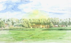
Farm on the Damse Vaart. Watercolour on hot pressed paper. 30 cm x 60 cm. 2023
I finally completed this watercolour (online, in the spotlight above and to the left in the email) which I began about ten years ago en plein air. It had always been intended as a study for an oil, so even though at the time it was quite light in tonality (see small image here to the right), I felt that I had what I needed for the oil. I laid the watercolour to one side and commenced with the oil (in the studio). But the oil, too, ended up getting interrupted by my years of studying philosophy @ KULeuven. I completed the oil then in 2019. All this time the watercolor languished.
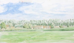
original watercolor study of a farm on the Dammevaart 2014
I liked it, but at the same time, felt it to be insufficient, incomplete. Both projects then stretching out over such long periods of time would seem to indicate a lack of interest/passion on my part. But that was not the case, mostly, it was simply frustration. Frustration with my skill to convey what I felt about that particular scene. It’s a group of farm buildings to the right of the Damse Vaart as you head out of town (from Brugge towards Damme). At about three in the afternoon, on a summer’s day the light plays so beautifully.
As a composition it’s a long horizontal landscape. The main attraction is the farm buildings in the middle-ground. Also, as a composition, the line of trees in the far distance present no problem. The visual challenge lay in the foreground: there was a large field of green pasture, out of which I wanted to extract some interest, leading the viewer in. I did locate a diagonal line there which I exploited, and in the oil, scattered in a few grazing cows. Still, to my eye the watercolour remained too light and insufficient.
Fast forward to last summer, as well as this one. I have found that imposing a circle in the centre of a watercoloured landscape can be helpful. It may or may not end up being visible in the final painting: doesn’t matter. For me, it helps to focus the elements without being formulaic, though last summer it defo veered in that direction. So I decided to try something like that with this one. I truly felt I had noting to lose: improve it or toss.
The result is, I think, an improvement. Also I kept in some pencil lines. To me they don’t detract. What do you think?
