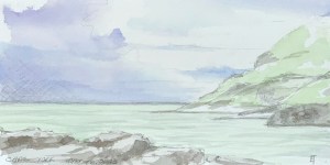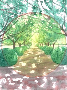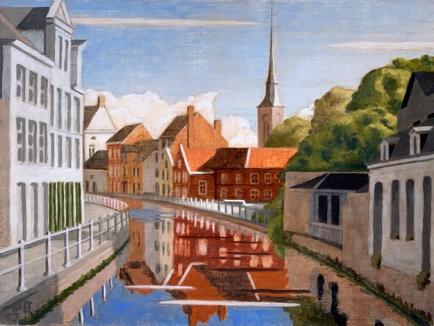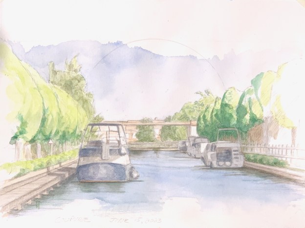

Coupurebrug, Left. Watercolor on hot pressed paper. June 15, 2033. 9 x 12″ or 23 x 30.5 cm
Our trip to Australia re-whet my whistle for exploring landscape using watercolour. I had begun re-exploring watercolour a bit last summer in the studio, but otherwise, it’s been awhile.
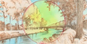
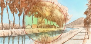
So on returning to Bruges, my thirst has been excentuated by the height of the summer solstice. Here, the days are long and warm, the nights are even longer. The effects of sunlight playing over the flat land with its canals, paths, bridges, trees and fields leads to endless sources of delight.
As I explore, I find I am refining my taste in tools and working methods. For example, I consistently find myself choosing a hot-pressed satin-finished paper in contrast to cold-pressed textured ones. Art shops these days stock mostly cold-pressed paper; it appears to be in style? I’m thinking that’s because spontaneous brush strokes, evoking grand abstracted images do very well on such a surface. But for me, because I enjoy rendering the fine details of a light soaked landscape, hot pressed paper wins. Hands down.
Then there’s the wcblocks themselves. Watercolor pads can be glued down on one side only, resulting in curving and buckling when the paper gets wet. Again, that may be OK for quick, vital brush strokes on cold pressed paper, but hot-pressed paper possesses not only the capacity to render fine detail, it also possesses the capacity to receive multiple washes. It’s important, especially when working wet-in-wet, to avoid that buckling, if possible. Buying watercolour blocks that are already glued down on all four sides instead of “pads” glued on just one side is yet another fine point.
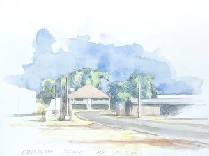
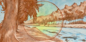
The landscape imaged here is an early summer’s evening over the Coupure. It’s from a bridge near to our house. I pass by almost every day and have noticed that looking right (see watercolor created a few weeks later) or left are equally exciting, depending on the time of day and conditions of light. So I finally took my pad and pencils out last week to capture the composition seen here. I knew from experience, that the boat arrangement along the canal changes every day, so in that first session I spent time getting down a realistic drawing, trying to get the proportions right, and feeling the light that I wanted to capture. I took a few photographs so I could finish it in the studio if the boats changed. Sure, enough, when I went back the next day, the arrangement was different, so I finished with my watercolour washes in the studio.
If you want to achieve a subtle sense of light within a realistic motif and in watercolor, as I tend to want to do, it works out better to finish such a painting in the studio. And hot-pressed paper lends itself to that: fine details, multiple washes, gentle refinement. I do enjoy an en plein air approach to painting when the conditions warrant. This just wasn’t one of them.