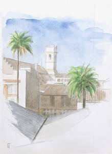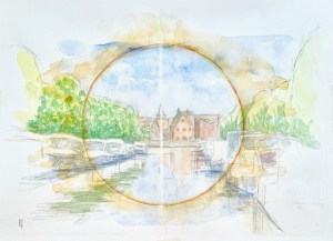
Conzettbrug, midday, looking south. 9 x 12″ or 23 x 32 cm watercolor on hot pressed paper.
Another piece along the theme: ‘there is a light, never goes out”.
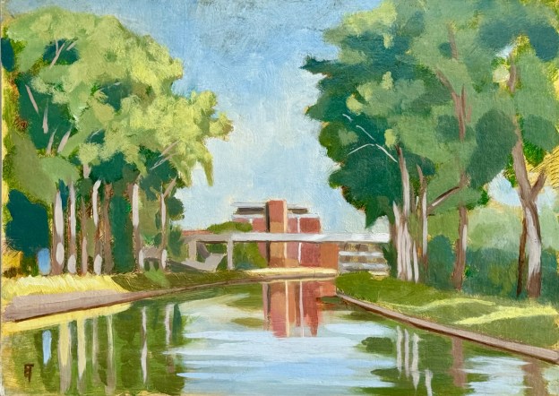
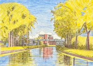
I began this composition last summer by creating an on-location drawing. However, as conditions in Belgium often are, the window of opportunity for creating a finished piece was far too brief. So, a few days ago, in the shining light, I decided to re-approach the project.
The challenge to this particular spot is that the perspective I really like is from the exact middle of a pedestrian bridge that spans the Coupure canal at the edge of the city. It’s a narrow span, maybe two meters in width? This allows for an active two way traffic flow of bi-peds, quadrupeds and bi-cycles. To plant myself in the middle of that bridge is to create an obstacle to the traffic flow: everyone is usually polite about it, but conditions are defo not optimal. Also, experiencing joggers there is quite something, their vibrations quickly announce themselves, and I bounce like a ceramic animal with a hinged neck on a car’s rear shelf window. 😉 So I gave myself enough time to create a fairly detailed value study but did not push my luck and chose to do the watercolor washes at home.
In addition, as anyone who has ever tried to create a drawing or painting of a boat harbor knows, boats come and go, so you have to quickly decide which to include and which to neglect. And even though that’s true of any type of painting, I think it’s especially true of harbors.
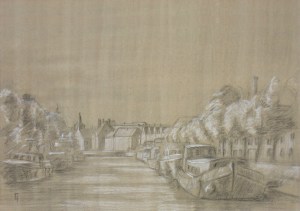
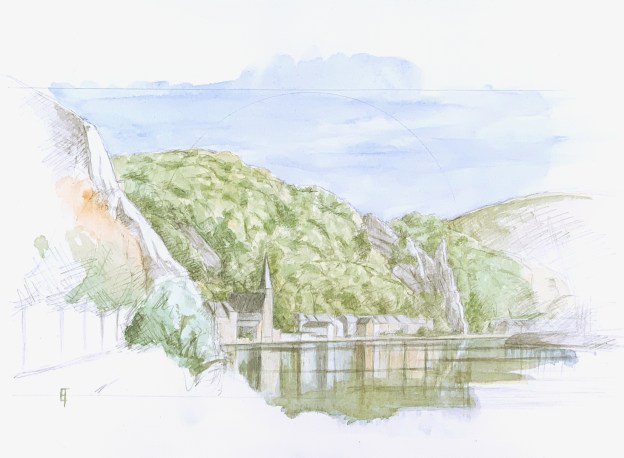
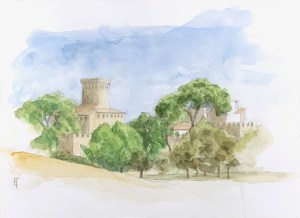
2009, Drawing from the Conzettbrug in Bruges
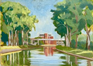
In the end I had about an hour to complete my drawing, to solidify my vision of it, to understand the conditions of light – and to snap a few photo-references. Back home, as I laid in my washes, I knew I wanted to say something more than a sweet little study of light (I had done that anyway, some fifteen years ago, see image to the right).
So, because I’m deeply drawn to one-point perspectives and I’m still using a circle motif to set-up my compositions, I decided to emphasize that circle with a cadmium yellow line wash, strengthened it with alizarine crimson, after my descriptive washes were done. Now the circle was certainly strong but it looked like a James Bond bulls-eye. Not the visual echo I was looking for, so I started laying in washes of yellow ochre outside the circle’s edges, tipping the block so that the washes always dripped away from center. Nice.
The final cherry on top was the fine line of light, created by running a finely sharpened eraser-pencil, up and down, vertically through the center.
NB: I like it, though as usual, it’s extremely difficult to get a good photograph of a high-key watercolor.