Author Archives: ellentrezevant

Unknown's avatar

About ellentrezevant

I'm an artisanal painter living in Bruges, Belgium and Oceanside, California. My work is figurative in the big picture and abstract in the details.

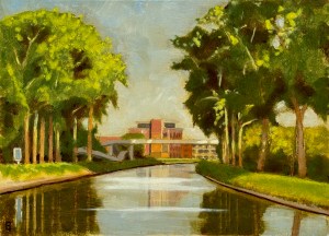
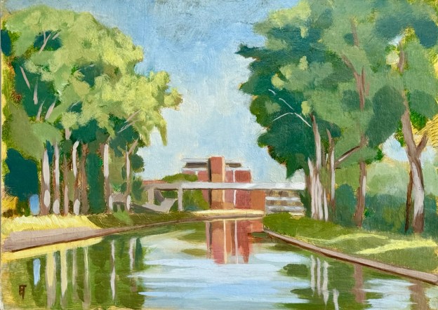
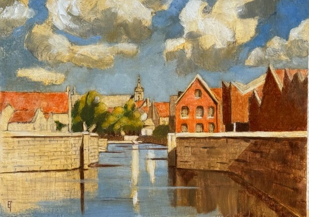
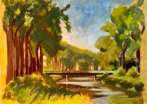
Avond aan de Jachthaven II, August 12, 2024. Oil on panel. 9 x 12" or 23 x 30.5 cm

Avond aan de Jachthaven II, August 12, 2024

During the “on location” sessions for Jachthaven I, I had become very disappointed with my loss of the statement of light, because in the end I had to slap on a lot of titanium white to make it work. The painting that I ended up with was OK, but not really what I had been trying to achieve aesthetically, thus version II.

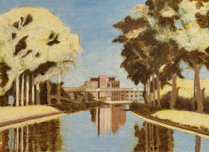
Avond aan het Jachthaven II, studio oil level one.

Avond aan het Jachthaven II, studio oil level one.

This second attempt had the same work-up in silverpoint, egg tempera and India ink as the first, however, I decided to do my first layer of oil in the studio (instead of relying on the vagaries of weather). I laid in a pretty definitive light statement (see right), working wet-in-wet. I used cobalt blue, lead white and burnt umber (mixed with an ET emulsion to help it dry faster) and painted this into a surface wiped thinly with a clear medium. The whole work-up process took only a week to do – in order to have it dry enough for an en plein air session – or two.

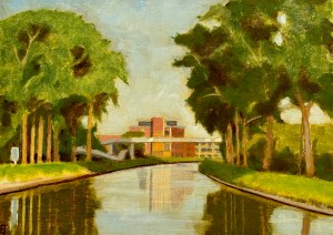
Avond aan de Jachthaven II, intermediate on site oil.

Avond aan de Jachthaven II, intermediate on site oil.

My first session was two hours, during which I  was able to take the light statement (above) to this stage (left). I made use of a technique I have come to call “painting backwards”. It’s where I block in a flat area of color on top of a light statement and then dig the particular highlights I need/want out of it. That’s only possible if-and-when the underpainting is already definitive and dry. Afterwards, I called it done for a few days, though still, I felt something else was needed.

Avond aan de Jachthaven II, August 12, 2024. Oil on panel. 9 x 12" or 23 x 30.5 cm

Avond aan de Jachthaven II, August 12, 2024. Oil on panel. 9 x 12″ or 23 x 30.5 cm

I went out last night, a hot summer’s evening, with perfect conditions. Here on the 52nd parallel north, we are currently about a month and a half past the (almost) 17 hour days of the summer solstice, yet it is still possible to “trip the light fantastic”. I spent about an hour adding small details (of light), which had the effect of bringing my mind’s eye vision to completion. I judiciously used some titanium white (especially in the water), but the magic really began to happen when little brush flecks of cadmium yellow light hit the trees.

I’m very glad to be able to chip away at the amount of time it takes me to create a landscape oil painting, because really, I’m notoriously slow. I still to try to avoid titanium white as much as possible, because it’s never made sense to me to prepare a white ground and then, through the act of painting, proceed to lose its luminosity so that you need to add titanium white back in in order to regain it. Don’t make no sense.

The difference between these two versions and techniques then, is luminosity. The first one relies primarily on TW and reflected light, while the second one relies essentially on refracted light, emanating, glowing, from the underpainting itself. That latter has always been my aesthetic goal, though admittedly, the results have often  been mixed. 😦

This one, however, is trending up! Let’s see what happens next.

If you are interested in this piece shoot me an email.

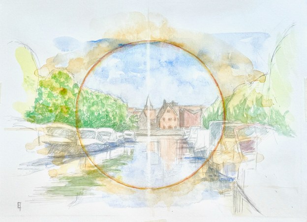
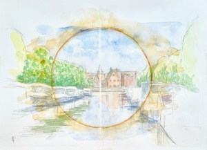
Conzettbrug, midday, looking south. 9 x 12" or 23 x 32 cm watercolor on hot pressed paper.

Conzettbrug, middag kijkend naar het zuiden

Conzettbrug, midday, looking south. 9 x 12" or 23 x 32 cm watercolor on hot pressed paper.

Conzettbrug, midday, looking south. 9 x 12″ or 23 x 32 cm watercolor on hot pressed paper.

Another piece along the theme: ‘there is a light, never goes out”.

I began this composition last summer by creating an on-location drawing. However, as conditions in Belgium often are, the window of opportunity for creating a finished piece was far too brief. So, a few days ago, in the shining light, I decided to re-approach the project.

The challenge to this particular spot is that the perspective I really like is from the exact middle of a pedestrian bridge that spans the Coupure canal at the edge of the city. It’s a narrow span, maybe two meters in width? This allows for an active two way traffic flow of bi-peds, quadrupeds and bi-cycles. To plant myself in the middle of that bridge is to create an obstacle to the traffic flow: everyone is usually polite about it, but conditions are defo not optimal. Also, experiencing joggers there is quite something, their vibrations quickly announce themselves, and I bounce like a ceramic animal with a hinged neck on a car’s rear shelf window. 😉 So I gave myself enough time to create a fairly detailed value study but did not push my luck and chose to do the watercolor washes at home.

In addition, as anyone who has ever tried to create a drawing or painting of a boat harbor knows, boats come and go, so you have to quickly decide which to include and which to neglect. And even though that’s true of any type of painting, I think it’s especially true of harbors.

the Conzettbrug

2009, Drawing from the Conzettbrug in Bruges

In the end I had about an hour to complete my drawing, to solidify my vision of it, to understand the conditions of light – and to snap a few photo-references. Back home, as I laid in my washes, I knew I wanted to say something more than a sweet little study of light (I had done that anyway, some fifteen years ago, see image to the right).

So, because I’m deeply drawn to one-point perspectives and I’m still using a circle motif to set-up my compositions, I decided to emphasize that circle with a cadmium yellow line wash, strengthened it with alizarine crimson, after my descriptive washes were done. Now the circle was certainly strong but it looked like a James Bond bulls-eye. Not the visual echo I was looking for, so I started laying in washes of yellow ochre outside the circle’s edges, tipping the block so that the washes always dripped away from center. Nice.

The final cherry on top was the fine line of light, created by running a finely sharpened eraser-pencil, up and down, vertically through the center.

NB: I like it, though as usual, it’s extremely difficult to get a good photograph of a high-key watercolor.

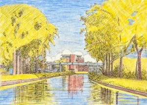
July, 2024, Avond aan de jachthaven, Brugge: "there is a light, never goes out"

July 2024, Avond aan de Jachthaven I, Brugge: “There is a light, never goes out”

July, 2024, Avond aan de jachthaven, Brugge: "there is a light, never goes out" 9 x 12" or 23 x 30 cm

July, 2024, Avond aan de jachthaven, Brugge: “there is a light, never goes out” 9 x 12″ or 23 x 30 cm

Last night I completed the third “on location” painting session for this little piece. It felt a bit like (finally) pulling a rabbit out of a hat.

It’s been a struggle primarily because of the summer Belgian weather (or lack of it). Secondly, because I’ve been navigating various tweaks to my newly self-designed and self-created pochade box. For example, at the start of session #2, the bracket attaching the box to my tripod fell off. 😦 So I had to sit on the ground for two hours. It was OK, but for the physical activity of painting, suboptimal. Thirdly, because I’m still (always) refining my technique.

aan de jacht haven Brugge/ the marina in Bruges. Watercolor on hot pressed paper. 9" x 12" or 23 x 30 cm.

aan de jacht haven Brugge/ the marina in Bruges. Watercolor on hot pressed paper. 9″ x 12″ or 23 x 30 cm.

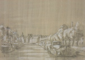
Thus, in part because of my temperament, and in part because of the weather, I worked up the initial layers in the studio. I already had the composition since it was based on a watercolor I had completed last summer: I loved the receding canal, the light on it at the end of the day, plus the glowing red brick building in the middle distance.

Aan de jacht haven Brugge/ the marina in Bruges. Underdrawing and underpainting on panel, touched up by India ink. 9" x 12" or 23 x 30 cm.

Aan de jacht haven Brugge/ the marina in Bruges. Underdrawing and underpainting on panel, touched up by India ink. 9″ x 12″ or 23 x 30 cm.

So I used that study to create an underdrawing (with silverpoint) and on that lovely, soft drawing, an underpainting (with egg tempera). After a light coat of shellac (to seal the panel off from the absorptions of the oil phase to come) I used a pen nib loaded with India ink to emphasize the composition’s darker values. All this was possible in the studio – and it laid down a solid, graphical foundation before all the accidents I knew painting “on location” would bring.

Both silverpoint and egg tempera are well suited to a panel prepared with true gesso (rabbit skin glue and chalk), however as techniques they cannot be used on a flexible canvas (the substrate of choice by painters since the 16th-17th century) primed with acrylic gesso (the ground of choice by painters since about the 1950’s). The record of my experiments in these against-the-current techniques is on my companion blog site atelierartisanal.com .

Why I have chosen this anachronistic technical direction is perhaps best examined from a therapist’s couch: it’s been the subject of much failure as well as heart-ache, but alas, it is the choice of my gevoelsmatig-bewustzijn (feeling-consciousness). And even though many of my experiments over these decades have not been successful, some have. There is a kind of internal mind’s-eye light I’ve been chasing. And I would also say that, thankfully, my batting average is beginning to improve! There is light at the end of this tunnel!

Additionally, I’m not sure if it’s even appropriate to call this an “en plein air” painting. The reason being, it was not painted “alla prima”, that is, all at once, in one session. For, besides the studio levels of image development described above, there were also the three “on location” evening sessions. So, if “alla prima” is an essential element of a definition of an “en plein air” painting, my work in general and this one in particular doesn’t fit. And relative to those three evening sessions, I’m hoping to whittle them down to just one or two (as long as the weather and my pochade-box holds ;-)). We’ll see what the future brings. 😉

If you are interested in this pieces please email me.

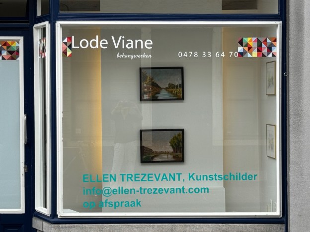
The Pop-up on the Langestraat is now closed

86 Langestraat, Bruges Belgium, June 2024

86 Langestraat, Bruges Belgium, June 2024

We intended to run this little experiment for six weeks, however, in the end it ran for only four. We closed it down a week ago. The lack of local response (perhaps due to no walk-in opening hours) became too frustrating for me; while for Lode my host, (due to the fact that he possesses no business license for his storefront) opening hours were just not an option. So we agreed to call it a day.

I have learned a few things. First and foremost, the art market in Bruges (in Belgium and even in Europe in general) appears to be focussed almost exclusively on contemporary art. And though I am familiar with contemporary art as a credo, it’s not a church I pray in (most of the time). Or, to put it differently, there’s just not a market for the kind of work realistic landscape work that I do, that I love to do, that brings me pleasure to do. Disappointing, but OK, understood. Move on.

Secondly, since I truly am interested in clearing out my attic – particularly of old work – I’m currently exploring other options. Most people, who are not actively creating themselves, don’t realize that if you’re not busy hustling your babies out and on to other destinations, the backlog that develops can become quite stultifying. And so, now that I’ve finally rediscovered my mojo, I’m very interested to restart with as clean a slate as possible.

I am grateful for everyone (yes, there were a few) who did contact me to come by. And indeed a few visitors did find something that they wanted to take home with them. Nice! Additionally, I’m even more grateful to Lode Viane for the use of his space. Bedankt, Lode!

So, now, it’s back to summertime bliss-land. I’m hoping to produce more simple, 9″x12″ (23 x 32cm) on-site landscapes this summer, similar to the recent Vivenkapelle and/or  Scharbrugge – if weather permits. I’ve designed a small pochade box which connects to a standard tripod. Those items, together with a very sturdy folding chair, all fit in my e-bike bags. Cool! I’m mobile and ready to explore the countryside. We’ll see what happens next. Stay tuned…

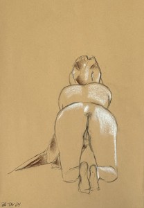
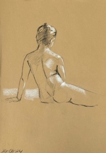
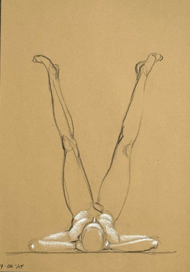
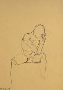
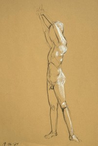
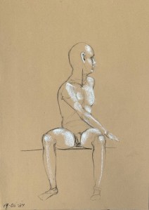
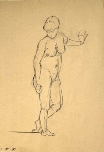
Fifteen minute figure study. Charcoal pencil on toned recycling paper. 35 x 50 cm

Figuur tekenen, figure drawing, June 26

Fifteen minute figure study. Charcoal pencil on toned recycling paper. 35 x 50 cm

Fifteen minute figure study. Charcoal pencil on toned recycling paper. 35 x 50 cm

Tonight was our lest session of the season. Here in Europe people really do take the summer off – and it pretty much follows the school year. So, end of June to the end of September.

Fifteen minute figure study. Charcoal pencil on toned recycling paper. 35 x 50 cm

Fifteen minute figure study. Charcoal pencil on toned recycling paper. 35 x 50 cm

Our model tonight was Dominique. She sat for us a few weeks ago. Since then we have become friends. Nice.

In terms of approach I  decided to keep with my new attempt to integrate the highlights quickly after laying in the figure. It’s often the case that I have about two minutes to do so, but if the figure is right the placement of the highlights takes no time and even less decision making.

Fifteen minute figure study. Charcoal pencil on toned recycling paper. 35 x 50 cm

Fifteen minute figure study. Charcoal pencil on toned recycling paper. 35 x 50 cm

Here are a few keepers of the evening. So for now, relax, enjoy and have a great summer!

figure drawing on recycled paper, 35 x 50 cm

Figuur tekenen/Figure Drawing, June 19, 2024

Fifteen minute figure study. Charcoal pencil on toned recycling paper. 35 x 50 cm

Fifteen minute figure study. Charcoal pencil on toned recycling paper. 35 x 50 cm

I spent the afternoon out in the field working on a new landscape watercolor, so I was really tired but also artistically lubricated by the time the weekly figure drawing session rolled around. Nice. Thus, after a few warm ups – and getting a more or less intelligible figure down on paper – I felt inspired and ready to jump back into laying in the highlights quickly (the way I used to do) but now also (at least hopefully) more accurately.

Fifteen minute figure study. Charcoal pencil on toned recycling paper. 35 x 50 cm

Fifteen minute figure study. Charcoal pencil on toned recycling paper. 35 x 50 cm

The three minute poses were still too incomplete – I’m still too slow. That will come, but for now, nothing to see here. I’m far more interested in getting accuracy first.

Fifteen minute figure study. Charcoal pencil on toned recycling paper. 35 x 50 cm

Fifteen minute figure study. Charcoal pencil on toned recycling paper. 35 x 50 cm

Anyway, our model tonight was a fellow we had about three weeks ago. His body is remarkably easy to read. I found myself joyfully discovering, first and foremost, the thoracic arch and the pelvis, the two (fixed) bookends upon which the torso rotates. That’s basic Bridgman – and I really appreciate it. From those landmarks the rest can follow: abdomen, external oblique (the “love handles” – not that this fine fellow had much to grab), clavicle, acromium process – and all that’s just the torso. The limbs extend from there. Here then are some keepers from the evening.

Schaarstraatbrug, Right. Oil on panel. June 10, 2024. 9 x 12" or 23 x 30.5 cm

Schaarstraatbrug, middag, kijkend naar het weste/Schaarstraat bridge, noon, looking (mostly) west

Schaarstraatbrug, Right. Oil on panel. June 10, 2024. 9 x 12" or 23 x 30.5 cm

Schaarstraatbrug, Right. Oil on panel. June 10, 2024. 9 x 12″ or 23 x 30.5 cm

For years I’ve been entranced by the view from the Schaarstraat bridge. I knew the time of year and time of day I wanted to capture for it offers a great opportunity to explore the complimentary colors of blue and orange. Last summer I was able get down a watercolor that I liked. Compositionally, it had what I was looking for, so I decided it could be a good start for an oil. The best part about that study was that I could work up the underdrawing in the studio and, so I imagined, finish it en plein air.

I know that most of the activity that goes by the name “en plein air” refers to an alla prima painting technique, which means the whole painting from start to finish is executed on location. (Of course, small touch ups in the studio are OK, but principally, the immediacy of painting “en plein air”, means painting in the moment, with (hopefully) a zen-like aesthetic insight and accuracy). I’ve got nothing against that, it’s just that I’ve come to realize that my aesthetic interests are a little different. The kind of color statements I want to make appear to be best supported by an indirect technique(!). Which means working up a painting, through layers – and these take time to dry.

Schaarstraatbrug, Right. Watercolor on hot pressed paper. July 2, 2023. 9 x 12" or 23 x 30.5 cm

Schaarstraatbrug, Right. Watercolor on hot pressed paper. July 2, 2023. 9 x 12″ or 23 x 30.5 cm

So, back to this piece. In the studio I worked up a drawing using silverpoint (it’s a very soft way to lay out the composition and make preliminary value statements). Then I lay in the basic color statements using egg tempera (it too, is a light and soft medium and, relative to oil, quite siccative). After the ET dried (about a week) I realized I might as well go ahead and do the first oil session indoors (since the weather was so bad!).

That first oil session was a return to the starting value statement but this time, stronger and more extreme, I used white, burnt umber and ultramarine blue. Woah, the result was more like a solarized photo, but promising. After it dried, I wanted to go out to finish it on site, but again the weather frustrated my building creative momentum: I just couldn’t wait. So I thought, heck, forget the men’s finals of the French Open, let’s see what can happen in the studio.

Surprisingly after a few hours of judicious glazing (the yellow ochre starting glaze was definitive), I saw what I had been looking for emerge on the panel. Nice! It’s so important to know when to stop when – beside the dinner bell – it’s time to lay down your brushes.

86 Langestraat, Bruges Belgium

Pop-up @ Langestraat 86 in Brugge

Hunter River. May 28, 2023. Watercolor on hot pressed paper. 6" x 12" or 15 x 30

Hunter River. May 28, 2023. Watercolor on hot pressed paper. 6″ x 12″ or 15 x 30 cm.

Last summer I rediscovered my mojo for landscape painting. It’s not as though I had ever really lost it, it’s just that the difficulties (as I experienced them) had temporarily overwhelmed my passion. The doorway to my return was definitely watercolor. As a medium, it can be incredibly difficult to master but also, as a medium, it’s very, very portable. So during our travels in Australia last spring the flue opened. On our return to Brugge, new watercolors began to flow. Where to put these new pieces in our already small and overflowing house?

Coupurebrug, Right. Watercolor on hot pressed paper. July 2, 2033. 9 x 12" or 23 x 30.5 cm

Coupurebrug, Right. Watercolor on hot pressed paper. July 2, 2033. 9 x 12″ or 23 x 30.5 cm

I asked my friend, Lode Viane, who maintains a storefront on the Langestraat (for his house-painting business) if I might be able to use his commercial window space to display some of my paintings somehow, sometime? He said sure, but we left it at that – for the moment.

This spring we revisited the idea. He suggested doing a few weeks long “pop-up”. Easy to facilitate. He offered me the right window for display purposes plus a set of keys to the front door. We ordered some vinyl lettering to announce the project and pressed it on to the lower front window edge. Eh, voila!

Dammsevaart oil on panel. 2012. 30 x 40 cm or 11 3/4 x 15 3/4 inches.

Dammsevaart oil on panel. 2012. 30 x 40 cm 11 3/4 x 15 3/4 inches.

Yesterday John and I brought some pieces over to set it up. Now we’re off and running. The focus of the exhibit is (primarily but not exclusively) local landscapes, in oil and watercolor. There’s space to exhibit four paintings in the front window, plus interior wall space for approximately 15 more. Passers-by can easily see the front display (which will change weekly) but if you are interested to gaze behind the curtain, make an appointment via info@ellen-trezevant.com. The pop-up will run May 26 – June 22. Hope to see you – if you’re in the hood!

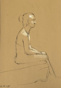
Fifteen minute figure study. Charcoal pencil on toned recycling paper. 35 x 50 cm

Figure Drawing, May 22, 2024

Fifteen minute figure study. Charcoal pencil on toned recycling paper. 35 x 50 cm

Fifteen minute figure study. Charcoal pencil on toned recycling paper. 35 x 50 cm

A different model tonight. A pear-shaped Venusian woman. She took good, challenging poses, though I confess I had difficulty reading the anatomical features which were so prominent last week in our tall, skinny, lightly ripped model. Tonight then was different.

Fifteen minute figure study. Charcoal pencil on toned recycling paper. 35 x 50 cm

Fifteen minute figure study. Charcoal pencil on toned recycling paper. 35 x 50 cm

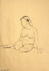
I was glad to find that at the end I did have a few keepers. In particular, one seated gem featured at the top of this webpage. All are fifteen minute studies.

Fifteen minute figure study. Charcoal pencil on toned recycling paper. 35 x 50 cm

Fifteen minute figure study. Charcoal pencil on toned recycling paper. 35 x 50 cm

One change I made this week was reverting to the smooth instead of the rough side of the recycling pad of paper that I usually use. The Watts Atelier , where I have sometimes taken figure drawing classes, encourages using smooth newsprint – not rough. Thus, I have found that the smooth side makes it easier to rub away light marks, when you want to. Inevitably there are changes to be made in your drawing, but this can happen without using an eraser. Just a little finger rub, one more thoroughly tactile way to engage with the experience of drawing.

Charcoal pencil on toned recycling paper.

Figure Drawing, Brugge, May 15, 2024

Fifteen minute figure study. Charcoal pencil on toned recycling paper. 35 x 50 cm

Fifteen minute figure study. Charcoal pencil on toned recycling paper. 35 x 50 cm

After a looong hiatus from Bruges but also from live figure drawing, I’m very happy to be back. During this particular interim I’ve been concentrating on studying the anatomy of the human figure: bones (skeletal), muscles, tendons, ligaments; but also differing schemes for abstracting figurative essentials in an accurate way. Mostly, these studies were done at the Watts Atelier in Encinitas, California – and most were done by using photo references from books. Tedious, perhaps. Uninspiring, well, yes; so you just had to supply your own. Which I did.

Fifteen minute figure study. Charcoal pencil on toned recycling paper. 35 x 50 cm

Fifteen minute figure study. Charcoal pencil on toned recycling paper. 35 x 50 cm

My own inspiration then, my own questions, after drawing from the figure on and off for about forty years, were and are very specific. I have or have had no difficulty feeling the figure or expressing my feelings on paper but I certainly have noticed that I don’t always get the proportions right and, relative to anatomy, I have felt myself to be quite ignorant. In the world of Modern/Contemporary Art, neither of those things are a problem so long as you say something “personal” and that was what I was taught back in the day at my liberal-arts-college art department. Personal distortion is more or less expected. But there, for whatever reason, my temperament begs to differ: I feel awkward if things are off while my body tells me with a distinct sense of relaxation when I get it right.

Fifteen minute figure study. Charcoal pencil on toned recycling paper. 35 x 50 cm

Fifteen minute figure study. Charcoal pencil on toned recycling paper. 35 x 50 cm

Descending into these “left-brained” studies then has been deeply frustrating. I’ve had to retrain the dog so that, at least temporarily, I became ignorant and uncoordinated. My movements were slower and unsure, as analysis replaced intuition. My drawings were incoherent. Some instructors assured us that there was light at the end of the tunnel. I certainly hoped so. The good news was that I was instructed to use cheap and simple charcoal pencils. Nothing fancy or expensive, so any attempt was easy to throw away, but also no high-end crutch to rely upon. 😉

Fifteen minute figure study. Charcoal pencil on toned recycling paper. 35 x 50 cm

Fifteen minute figure study. Charcoal pencil on toned recycling paper. 35 x 50 cm

So here tonight, after returning to Brugge, I can feel and see some progress being made. My three minute gestures are currently trash (I am still moving too slowly) but all of the fifteen minute studies were “keepers”. Before I began my studies my batting average was maybe 50%? So my proportions are improving and I experienced great joy in discovering the various skeletal protrusions I had studied. Even the final pose of the night, a five minute energetically expansive one, fell into place quite quickly. Ha!

Five minute gesture study. Charcoal pencil on toned recycling paper. 35 x 50 cm.

Five minute gesture study. Charcoal pencil on toned recycling paper. 35 x 50 cm.

I can imagine that over time I will be able to return to the chiaroscuro I used to enjoy so much. That is, placing highlights and shadows quickly – but accurately. For now though, placement on the page with proportional and gestural accuracy is improving so I’m happy.