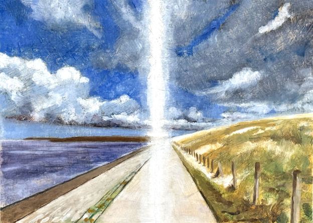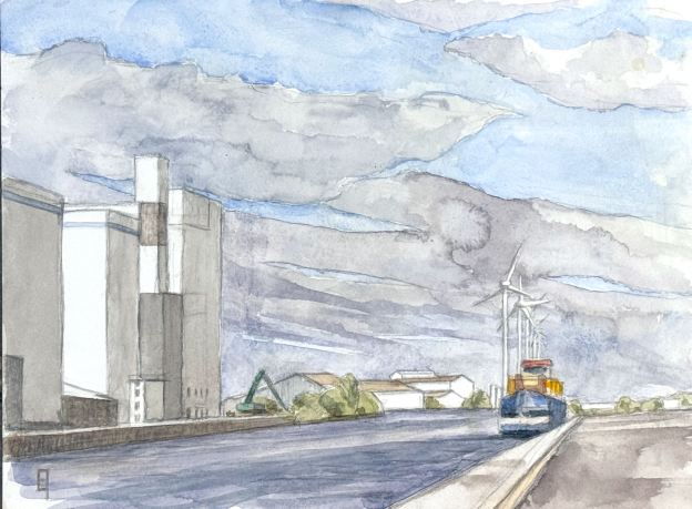
I went out Sunday morning to explore more of the scenery around the Bruges harbor. There is one area in particular that I’ve had my eye on for a while. It’s the terminus of the Zeebrugge harbor, where large cargo ships come to load or unload closer to town. Indeed, most of the heavy lifting occurs in Zeebrugge on the coast. Still, it is a large, industrial kind of place, which on the day I went did have one cargo ship resting in port.
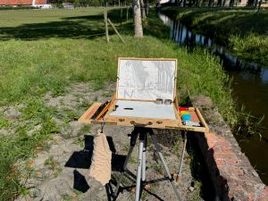
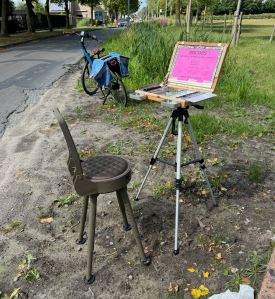
I set up and spent about four hours. Three of them consisted in just getting down a composition in which the perspective read more or less correct. Given all the shapes it was quite a challenge. Then I had about an hour of painting, during which I was able to get almost all of the main elements in. However, the one set of objects that I did not attempt were the windmills, principally because I had forgotten to bring along my latex masking fluid(!). Their lines are far too white and too fine to attempt without putting in some blocking first, so when it came to the sky, I just snapped a photo reference and decided to finish it at home. This is the result. I like the sky!
Hot pressed paper allows for detail which cannot be obtained with cold pressed, that’s just one reason I’m such a fan. As for the subject matter, even though the main thrusts were large and simple, the composition had a lot of complexity to it, especially in the distance. There were a number of small white reflections. How to retain the white of the paper? Always a challenge. Due to all that, I am particularly happy with the results – and the windmills. 😉 No jousting was needed.
Oh, and by the way, the large buildings on the left are the same buildings depicted in Light Study on the Pathoekeweg but now 180 degrees in reverse and fronting on the water. I love recto-versos.
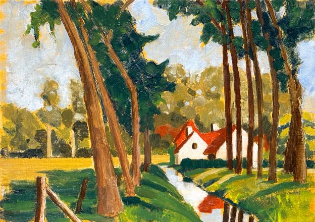
If you are interested in hanging this on your wall, please contact me.