
I returned to Ruskin’s “The Elements of Drawing” this summer. (It’s always good to start anew and never assume that you know whatever you think you know – because most likely, you don’t) So as I was playing around with watercolours, Ruskin suggested creating shapes and filling them in, beginning with the most basic of shapes, the circle. I was creating these sun-like shapes on a landscape oriented pad, 6″ x 12″ and immediately wanted to superimpose a real landscape over it. So I did.
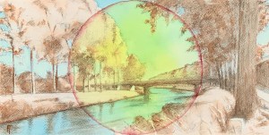
The Schipdonk Canal. Watercolour on cold pressed paper. 6″ x 12″ SOLD
The first in the series, was of a scene along the Schipdonk canal somewhere around Eeklo. Since I thought it turned out rather well, I thought, hmmmm…., this could be the beginning of a beautiful friendship? I liked the serendipitous contribution of the sun-like circle, compositionally and chromatically, enhancing its one-point perspective. I also liked the idea of doing the landscape in a simplified colour scheme of two complimentary colors. I began to imagine doing more, particularly of my favourite scenes around here.

Farm on the Damme Vaart. Watercolour (Alizarine Crimson and Thalo Green Light) on cold pressed paper. 6″ x 12″
The second in the series then is of a farm along the Damse Vaart that I have painted in the past. I really like the sweet, afternoon light on the farm buildings in the middle ground but have struggled to make it an interesting composition. Would this circle approach help? I decided to try it with a green/red palette, The result was OK, but compositionally, still rather static, so I enhanced the golden circle with an external wash of purple. It felt pretty rad. 🙂
Framed. $50 or 50 Euros plus shipping and handling.
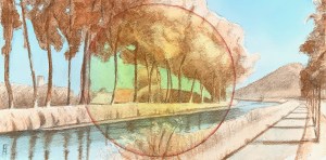
Bend in the Damme Vaart. Watercolour (Thalo Blue and Burnt Sienna) on cold pressed paper. 6″ x 12″
Well, OK, what’s next? I have plenty of favourite spots around here, so I chose another one further along the Damse Vaart, this time at its bend (which I have also painted in the past). I ended up doing three different versions of it: the first in a ‘normal’ colour scheme’ (boring!); the second in Thalo Blue/Burnt Sienna but with a horizon line that was about a 1/2″ too high (ugh!, toss); and the last one (pictured here) with the Blue/Sienna colour scheme but a lowered horizon line ( it finally felt right chromatically and compositionally).
Framed. $50 or 50 Euros plus shipping and handling.
Luckily these small experiments are easy to do so there’s more to come. Stay tuned…
Please contact me if you are interested in either of the DaamseVaart pieces.
