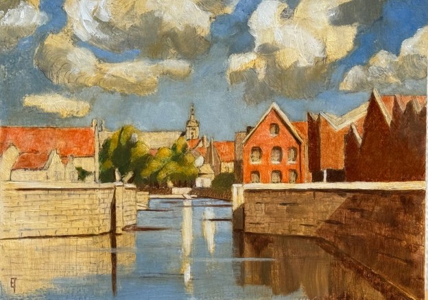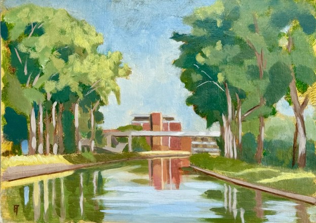
July, 2024, Avond aan de jachthaven, Brugge: “there is a light, never goes out” 9 x 12″ or 23 x 30 cm
Last night I completed the third “on location” painting session for this little piece. It felt a bit like (finally) pulling a rabbit out of a hat.
It’s been a struggle primarily because of the summer Belgian weather (or lack of it). Secondly, because I’ve been navigating various tweaks to my newly self-designed and self-created pochade box. For example, at the start of session #2, the bracket attaching the box to my tripod fell off. 😦 So I had to sit on the ground for two hours. It was OK, but for the physical activity of painting, suboptimal. Thirdly, because I’m still (always) refining my technique.

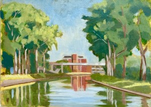
aan de jacht haven Brugge/ the marina in Bruges. Watercolor on hot pressed paper. 9″ x 12″ or 23 x 30 cm.
Thus, in part because of my temperament, and in part because of the weather, I worked up the initial layers in the studio. I already had the composition since it was based on a watercolor I had completed last summer: I loved the receding canal, the light on it at the end of the day, plus the glowing red brick building in the middle distance.
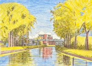
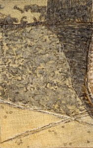
Aan de jacht haven Brugge/ the marina in Bruges. Underdrawing and underpainting on panel, touched up by India ink. 9″ x 12″ or 23 x 30 cm.
So I used that study to create an underdrawing (with silverpoint) and on that lovely, soft drawing, an underpainting (with egg tempera). After a light coat of shellac (to seal the panel off from the absorptions of the oil phase to come) I used a pen nib loaded with India ink to emphasize the composition’s darker values. All this was possible in the studio – and it laid down a solid, graphical foundation before all the accidents I knew painting “on location” would bring.
Both silverpoint and egg tempera are well suited to a panel prepared with true gesso (rabbit skin glue and chalk), however as techniques they cannot be used on a flexible canvas (the substrate of choice by painters since the 16th-17th century) primed with acrylic gesso (the ground of choice by painters since about the 1950’s). The record of my experiments in these against-the-current techniques is on my companion blog site atelierartisanal.com .
Why I have chosen this anachronistic technical direction is perhaps best examined from a therapist’s couch: it’s been the subject of much failure as well as heart-ache, but alas, it is the choice of my gevoelsmatig-bewustzijn (feeling-consciousness). And even though many of my experiments over these decades have not been successful, some have. There is a kind of internal mind’s-eye light I’ve been chasing. And I would also say that, thankfully, my batting average is beginning to improve! There is light at the end of this tunnel!
Additionally, I’m not sure if it’s even appropriate to call this an “en plein air” painting. The reason being, it was not painted “alla prima”, that is, all at once, in one session. For, besides the studio levels of image development described above, there were also the three “on location” evening sessions. So, if “alla prima” is an essential element of a definition of an “en plein air” painting, my work in general and this one in particular doesn’t fit. And relative to those three evening sessions, I’m hoping to whittle them down to just one or two (as long as the weather and my pochade-box holds ;-)). We’ll see what the future brings. 😉
If you are interested in this pieces please email me.