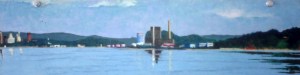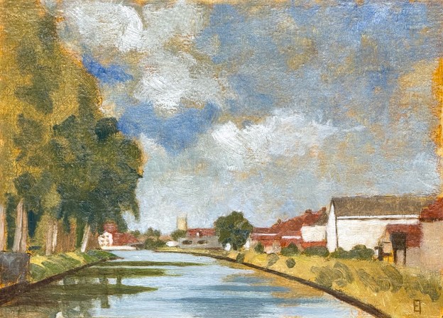
Langs de Vaartdijk II. Oil on panel. September 2025. 9 x 12.5" or 23 x 32 cm.

Langs de Vaartdijk II, September 2025

Langs de Vaartdijk II. Oil on panel. September 2025. 9 x 12.5" or 23 x 32 cm.
Langs de Vaartdijk II. Oil on panel. September 2025. 9 x 12.5″ or 23 x 32 cm.

It’s early September, the last days of summer are upon us. I went out last Sunday, prospecting for a new painting, and ended up choosing this scene along the Vaartdijk, looking back towards Brugge. I had already done one along this canal about ten years ago, different location, different view. In this scene you can just see the tower of the Gentpoorte rising in the distance, a little to the left of center.

I set up with my chair, paintbox and tripod, situated upon a dijk, rising to the left of the bicycle path. It was about four feet wide. I knew: any wrong move would land me in the water, swimming around with the little duckies. (Didn’t happen, but could have been refreshing if it did.)

I spent about three hours sketching in the scene using silverpoint, until I began inking it in with my black pen nibs. After a few lines, both pens dried out(!). Yes, it was a 30 degree centigrade day out there, but still, maybe time to buy some new ones? So I closed up shop and replaced them the following day. I completed my B/W drawing at home, anticipating going out as soon as possible to render the scene in oil en plein air.

The weather on Tuesday was clear enough and warm enough to give it a shot. As I worked, the shadows lengthened, making the reflections in the water more and more and more interesting. By five pm, as I packed up, I knew how I wanted to handle the water but also knew that it would have to wait until its painted surface had dried enough to do what I felt was still needed.

I ended up using five pigments plus white for this one: ultramarine blue, raw umber, yellow ochre, cadmium yellow light, plus cadmium orange. I used bristle brushes to block in my underpainting and sables to render the details. I made the wished for changes to the water yesterday, which means that I can post this today, chalking up yet one more for this summer season in Bruges. I love singing its praises.

If you are interested in hanging this on your wall, please contact me.

Afternoon light on the A11 bridge over the Zeebrugge Canal. September 2025 Oil on panel. 9 x 12.5' or 23 x 32 cm.

Afternoon light on the A11 bridge over the Zeebrugge Canal

We’ve ridden our bikes up to Lissewege a few times this summer. Every time we turn north onto the Zeebrugge canal, I’ve been struck by the span of a big, white bridge, just as the canal widens towards the sea. So even though it’s a half hour bike ride from home, last Monday I decided to try my luck in capturing it.

Study for the A11 bridge over the Zeebrugge Canal. September 2025  Silverpoint and India ink on gessoed panel.  9 x 12.5' or 23 x 32 cm.
Study for the A11 bridge over the Zeebrugge Canal. September 2025 Silverpoint and India ink on gessoed panel. 9 x 12.5′ or 23 x 32 cm.

I biked out on a sunny day and spent about four hours getting down a relatively detailed drawing – directly onto my gessoed panel. I moved through the free sketch of a charcoal pencil, to the more decisive silverpoint nib and finally committed myself to a finished design using India ink. By that point it was both a composition and a value study. When you spend four hours on location, studying shapes and light, you learn to read the three dimensionality of the scene before you, so that whatever values you end up placing there need to tell that story. See image to the left.

Friday the forecast was for warm and clear skies. I decided to go out. I also wanted to test out my new $$ tripod(!). Its connection to the bracket on the underside of my painting box was solid (no more wobbles) plus the legs themselves were very sturdy. Worth the upgrade (but I do need to sell more paintings to cover that expense! 😉 ).

Afternoon light on the A11 bridge over the Zeebrugge Canal. September 2025 Oil on panel. 9 x 12.5' or 23 x 32 cm.
A11 bridge over the Zeebrugge Canal. September 2025 Oil on panel. 9 x 12.5′ or 23 x 32 cm.

I spent another four hours laying in color, moving through a lean, mid-value underpainting to the definitive highlights and shadows of the final piece you see here. The strong white values of the central bridge dominate the composition while the interstices of the upper supports were defo an exercise for MC Escher himself (!). I couldn’t have rendered them in white paint without having already done my homework in the preparatory drawing stage. Despite their long horizontal slants the (two) bridges balance out compositionally by the path and the water. I like it.

As it turns out, I worked with a limited palette: lead white, yellow ochre, cadmium yellow light, raw umber and ultramarine blue. That’s it! Whenever possible it is good to work with a limited palette, it reduces the choices plus assists in creating a visual harmony. In the end, a success. A completed painting – and yes, in just one session. That’s the third one of this season: hooray! I might finally be on to something. 😉

If you are interested in hanging this on your wall, please contact me.

Midday light on the Bruges harbor. Oil on panel. 23 x 32 cm or 9 x 12.5" August 2025.

Brugge Haven Middag, August 2025

Midday light on the Bruges harbor. Oil on panel. 23 x 32 cm or 9 x 12.5" August 2025.
Midday light on the Bruges harbor. Oil on panel. 23 x 32 cm or 9 x 12.5″ August 2025.

I decided to transpose the watercolor composition I did last week onto a panel so that I could try out an expansive harbor painting. It took two en plein air sessions to come up with this.

The challenges: large cargo boats coming and going, obstructing or enhancing the view, what to include what to dismiss?; also the buildings on the left provided strong shifts from early morning to midday, make a choice and stick with it.

Mostly I wanted the composition to enhance the small white buildings in the distance. In order to get them to read, I needed an interesting foreground. Luckily there was a ship on the right during my first session, while the tall, sharply illumined buildings on the left provided balance. A windless day during the second session offered fantastic liquid reflections. (Take the money and run!) Later, I could include traces of its dance along the large, open channel, leaving the sky too, open and clear – as it was.

New Haven harbor from Lighthouse Park. 1979. Oil on panel. 6 x 15"
New Haven harbor from Lighthouse Park. 1979. Oil on panel. 6 x 15″

Oh yes, the session also included (for me) a sweet recognition my penchant for industrial harbors. I originally discovered my passion for landscape painting back in the 1970’s when I lived in New Haven Connecticut. I did a series of landscapes then of its harbor. Oil tanks. Industrial chimneys. Geometric shapes. So, the subject matter is quite similar, the color scheme, too. Yummm….

If you are interested in hanging this on your wall, please contact me.
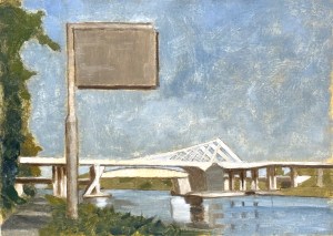
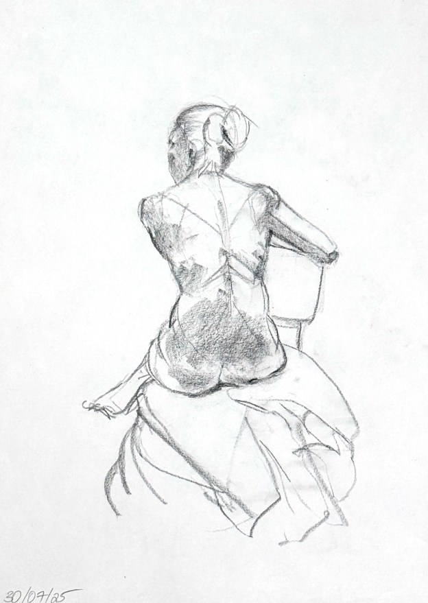
Figure Drawing, charcoal pencil on white drawing paper. 30 x 42 cm or 12 x 16.5"

Figure Drawing, July and August 2025

Figure Drawing, charcoal pencil on brown recycled paper. 35 x 50 cm or 14 x 20"
Figure Drawing, charcoal pencil on brown recycled paper. 35 x 50 cm or 14 x 20″

Open figure drawing sessions usually stop for the summer here in Bruges, but luckily, this year they did not. A stalwart stepped up and volunteered to organize them. So the usual cast of characters, including myself, jumped in. Hooray!

Due to the instruction I have been receiving at the Watts Atelier in Encinitas, California though, my approach to figure drawing has changed – pretty radically. The Watts approach takes you back to basics so you can build up (correctly) from there. No one (who has already been drawing from the figure for decades) signs up for this unless they have become convinced of their (classical-method) ignorance.

Figure Drawing, charcoal pencil on brown recycled paper. 35 x 50 cm or 14 x 20"
Figure Drawing, charcoal pencil on brown recycled paper. 35 x 50 cm or 14 x 20″

So I’ve learned how to sharpen a pencil (seriously!). I’ve also learned how to hold that pencil (double seriously!!). I’ve learned how to create a line firmly and succinctly, without the chicken scratch of hesitation. I’ve learned how useful cheap, smooth newsprint can be (which strangely enough is not available in Europe!!). And yes I’ve learned anatomy, but perhaps more importantly I’ve learned methods of abstraction so as to quickly locate gesture and then turn it into meaningful form and structure. At all this I am still a rank beginner, but every once in awhile, I can see light at the end of the tunnel.

Here are a few of the more successful drawings from this summer. September still beckons with regular sessions recommencing soon at the Hoeve Hangerin. We’ll see what happens.

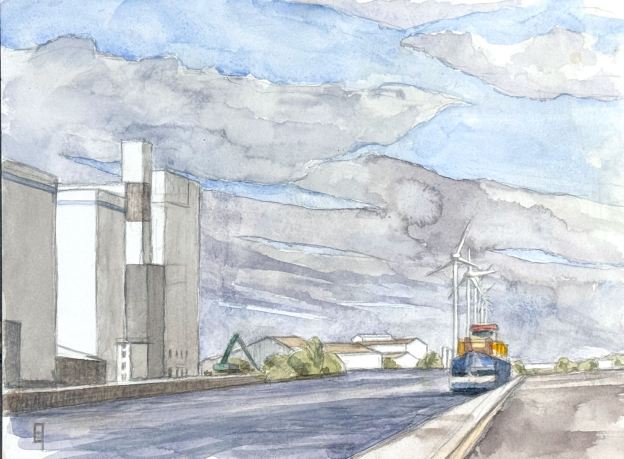
Midday light at the Bruges Harbor. August 17, 2025. Watercolor on hot pressed paper. 23 x 32 cm or 9 x 12.5 "

Midday light at the Brugge Haven, watercolor, August 17

Midday light at the Bruges Harbor. August 17, 2025. Watercolor on hot pressed paper. 23 x 32 cm or 9 x 12.5 "
Midday light at the Bruges Harbor. August 17, 2025. Watercolor on hot pressed paper. 23 x 32 cm or 9 x 12.5 “

I went out Sunday morning to explore more of the scenery around the Bruges harbor. There is one area in particular that I’ve had my eye on for a while. It’s the terminus of the Zeebrugge harbor, where large cargo ships come to load or unload closer to town. Indeed, most of the heavy lifting occurs in Zeebrugge on the coast. Still, it is a large, industrial kind of place, which on the day I went did have one cargo ship resting in port.

I set up and spent about four hours. Three of them consisted in just getting down a composition in which the perspective read more or less correct. Given all the shapes it was quite a challenge. Then I had about an hour of painting, during which I was able to get almost all of the main elements in. However, the one set of objects that I did not attempt were the windmills, principally because I had forgotten to bring along my latex masking fluid(!). Their lines are far too white and too fine to attempt without putting in some blocking first, so when it came to the sky, I just snapped a photo reference and decided to finish it at home. This is the result. I like the sky!

Hot pressed paper allows for detail which cannot be obtained with cold pressed, that’s just one reason I’m such a fan. As for the subject matter, even though the main thrusts were large and simple, the composition had a lot of complexity to it, especially in the distance. There were a number of small white reflections. How to retain the white of the paper? Always a challenge. Due to all that, I am particularly happy with the results – and the windmills. 😉 No jousting was needed.

Oh, and by the way, the large buildings on the left are the same buildings depicted in Light Study on the Pathoekeweg but now 180 degrees in reverse and fronting on the water. I love recto-versos.

If you are interested in hanging this on your wall, please contact me.
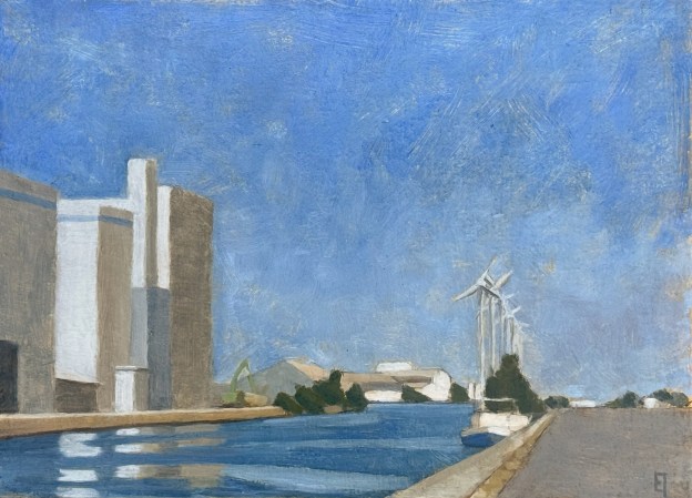
Light Study on the the Pathoekeweg. Oil on panel. 9 x 12.5" or 23 x 32 cm.

Light Study on the Pathoekeweg

Light Study on the the Pathoekeweg. Oil on panel. 9 x 12.5" or 23 x 32 cm.
Light Study on the the Pathoekeweg. Oil on panel. 9 x 12.5″ or 23 x 32 cm.

There is an industrial area outside the center of Bruges that most tourists don’t see. Perhaps for good reason. It’s the harbor that leads via canal to the port of Zeebrugge on the North Sea and is about 15 kilometers long.

I really like the geometrical shapes you can find there – at scale – especially when illumined by light. A few years ago I noticed the late afternoon light hitting some big ugly buildings at the edge of a scrubby dry field on the Pathoekeweg (the road that runs along next to the harbor). Nothing to see here? I beg to differ.

Light Study on the the Pathoekeweg. India ink and silverpoint on panel. 9 x 12.5" or 23 x 32 cm.
Light Study on the the Pathoekeweg. India ink and silverpoint on panel. 9 x 12.5″ or 23 x 32 cm.

Last summer I did a drawing of the grouping, intending to create a watercolor first, but in the end, just transposed the drawing to a gessoed panel so I could jump right into oils. The panel-drawing was done in silverpoint and India ink. I shellac-sealed it then waited for a warm, sunlit afternoon. A few days ago conditions arose; I packed up my gear and headed off to see what might happen. On arrival, at 4 pm, the light was OK, but nothing spectacular. Yet as the afternoon waned and early evening approached, it all got glorious. By 6 pm I was singin’.

The painting you see here was created in a two and one half hour session. At the time I had treated it as an underpainting, fast and loose, fully expecting to return for a final session. But the more I live with it now, the more I recognize that there is no need to do that. Sometimes less is more.

If you are interested in hanging this on your wall, please contact me.
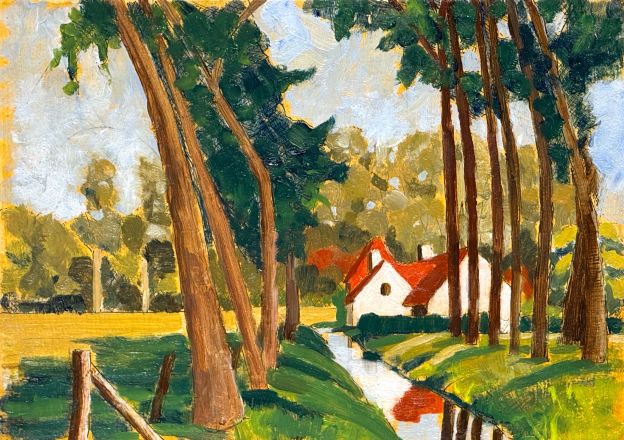
Olie schilderij van de Paarden Hoeve aan Fort van Beieren. 23 x 32 cm or 9 x 12.5 "Oil on panel. August 12, 2025

Midday at the horse farm/Middag op de paardenborderij, August 12, 2025

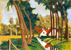
Last week I created a watercolor of this sweet little landscape that I discovered just outside of Bruges near the Fort van Beieren. I’m always on the lookout for landscapes that combine nature with a few geometrical, manmade shapes. And when the light spotlights these shapes, I’m in hog heaven. This one, including the white washed sides of a red roofed farm house, surrounded by fields and a small creek had all the ingredients I’m usually on the look out for. So, the watercolor was fine, but I was particularly interested in the intensity that can only oil can offer.

I transposed the composition from the watercolor – since that saves making a ton of new decisions in the field. I used india ink and silverpoint on a chalk gesso panel, then gave it a quick shellac-seal for protection and to reduce absorbency.

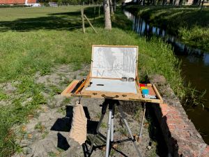
Field set up of pochade box with transposed India inked drawing, ready for oil.

The first painting session last Saturday involved laying in a yellow ochre tint into which I blocked in the values and tints of all the basic forms. At the end of that session I had a good, gestural underpainting, everything was understated, earthy and yet harmonized. Ever since I changed my recipe last year to egg yolk (instead of a methyl cellulose glue) for my painting emulsion, I’ve had good success – both in drying time as well as fluid paint handling. Encouraging!

The underpainting was dry to the touch after two days(!). I went out yesterday to see what might happen. The weather was perfect. Warm and sunny with a gentle breeze. I set up my traveling oil pochade box and set to work (it has a different design than my traveling drawing/watercolor box due to the requirements of the different media). The time passed. After three hours I looked back happy and decided to call it a day. (“Day!”)

Olie schilderij van de Paarden Hoeve aan Fort van Beieren. 23 x 32 cm or 9 x 12.5 "Oil on panel. August 12, 2025
Olie schilderij van de Paarden Hoeve aan Fort van Beieren. 23 x 32 cm or 9 x 12.5 “Oil on panel. August 12, 2025

I love the white building gently nested near the center, with the mirrored creek leading forward. The complimentary colors of organic reds and greens provide all the passion this kind of landscape evokes. The trees gawkily bend upwards: my kind of cathedral. Here’s hoping the weather continues to provide a few more opportunities to my Belgian muse.

If you are interested in this piece shoot me an email.

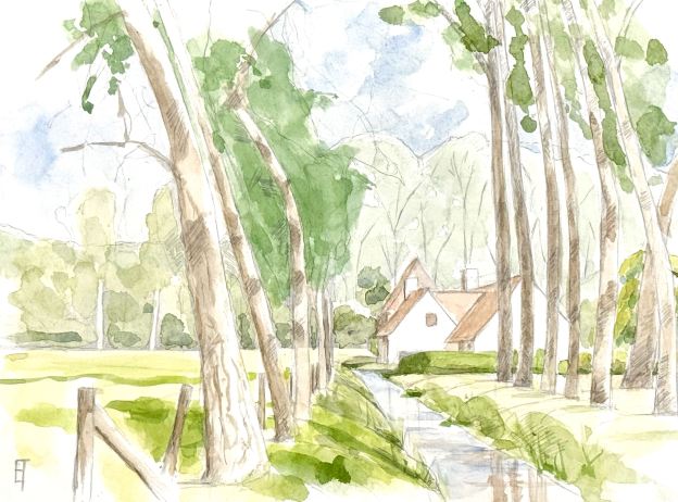
Paarden Hoeve naast Fort van Beieren. Watercolor on hot pressed paper. 23 x 31 cm or 9 x 12"

de Paarden Hoeve naast Fort van Beieren, August 4, 2025

Paarden Hoeve naast Fort van Beieren. Watercolor on hot pressed paper. 23 x 31 cm or 9 x 12"
Watercolor on hot pressed paper. 23 x 31 cm or 9 x 12″

Out towards Koolkerke along the Damse Vaart I found a sweet little farm house next to a creek. The whitewashed walls of the farmhouse brilliantly reflect the afternoon light, while the rows of willowy trees line the creek leading up to it. I decided to try and capture it. The first session was just for getting down a drawing for the composition. The second session was for painting.

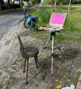
Luckily, my new traveling watercolor box easily and firmly snapped onto my tripod while my Quacke traveling chair allowed me to sit outside for a few hours on Sunday to try and make the attempt. The light was not great and it was really windy, too. But I was too happy to even notice. Photo of my rig to the right.

This is a study. I hope to create an oil based on this composition soon. It’s such a typically Belgian landscape. So intimate. I might try to add in the horses – which did stop by to say hello. I promised I’d bring apples next time. They said: Ney 😉

If you are interested in this watercolor shoot me an email.

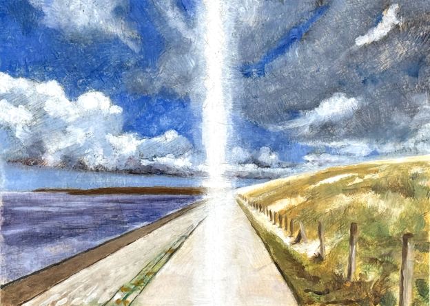
There is a Light, never goes out. July 2025. Oil on panel. 23 x 32 cm or 9 x 12.5"

There is a Light – never goes out, July 27, 2025

There is a Light, never goes out. July 2025. Oil on panel. 23 x 32 cm or 9 x 12.5"
There is a Light, never goes out. July 2025. Oil on panel. 23 x 32 cm or 9 x 12.5″

Last summer my husband and I did a weekend biking trip to Zeeland, a beautiful area of windswept dunes to the east of Brugge. Just before we left on that weekend I had had a biking accident here in Brugge where I met the cobblestones (up-close-and-personal) – and without a helmet. During our trip then, I was suffering from a slight concussion, which may (at least in part) explain this painting.;-)

We were biking along a stretch of pathway a few kilometers outside of Zerikzee when the storm clouds began to threaten and blow: alternating light and darkness; wind and rain. We just kept moving. Meanwhile the song “There is a Light, never goes out” by Steve Gold, came into my head and wouldn’t leave.

Luckily, Johnny had created a small video of that stretch of experience so I could grab parts of it to help me experiment with visualizing the inspiration of that time-less time. My penchant for one-point perspective dominates the composition – and provides a counter point to the strong central shaft of light. But I was careful not to align the two as it would have created a dead center with nowhere to go(!). Additionally, I did integrate a small circle (ultimately not very visible) – which I have been using these days to assist in creating an abstract element to an otherwise basic landscapes.

Is this a new direction? Maybe but maybe not.;-) But still, I like it.

If you are interested in this painting, shoot me an email.

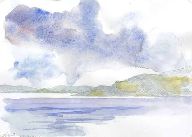
Arriving Londonderry II. 22 June 205. Watercolor on hot-pressed paper. 21 x 32 cm or 9 x 13"

Watercolors of arriving @ Londonderry, Ireland, June 22, 2025

Arriving Londonderry I. 22 June 2025. Watercolor on hot-pressed paper. 21 x 32 cm or 9 x 13"
Arriving Londonderry I. 22 June 2025. Watercolor on hot-pressed paper. 21 x 32 cm or 9 x 13″

When you’ve been out at sea for five days, with the endless horizon stretching in all directions, it is thrilling to spot land once again. As we headed up the coast, approaching Northern Ireland, the Observation Deck became crowded with other passengers who seemed to feel the same way. Excitement, beauty – and the play of light upon rocks and hills and GREEN vegetation!

Arriving Londonderry II. 22 June 205. Watercolor on hot-pressed paper. 21 x 32 cm or 9 x 13"
Arriving Londonderry II. 22 June 205. Watercolor on hot-pressed paper. 21 x 32 cm or 9 x 13″

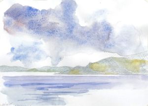
I brought out my trusty travel box to try to capture some of this excitement – and this light. The challenge of doing a watercolor under these conditions, not only of rapidly changing light, but also of a steadily changing composition of forms (due to a moving boat), meant making quick decisions about what I wanted to say and then sticking with it. Land, sea and sky: three elements in their awesome simplicity. Because of all that, I feel the second attempt is more successful than the first. Even a learning based on the first. I’m posting both because I’m not ashamed or embarrassed of the first one, it has some nice energy, motion and light, but overall, I feel the second one is a bit cleaner. Each one took maybe an hour – at most.

Anyway, here they are Arriving Londonderry I & II. If you are interested in either of these pieces please shoot me an email.