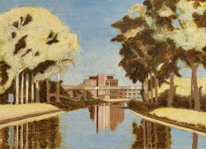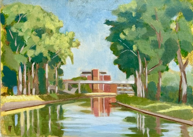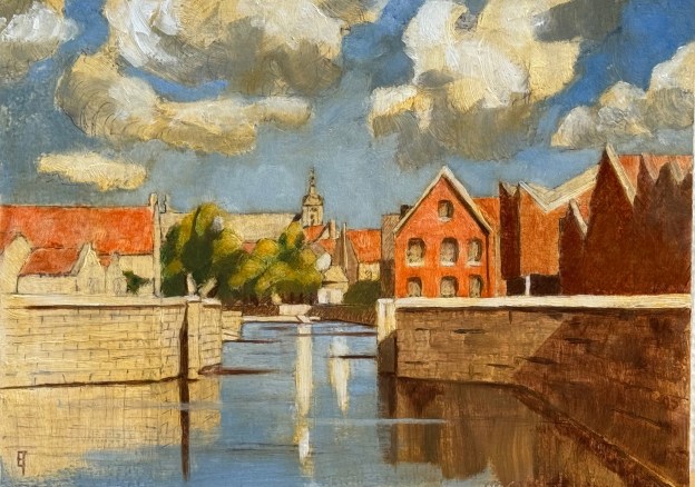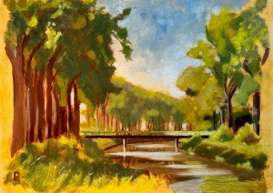
de groene brug over de Stinker naast het oude sifon, Olie op paneel, august 2024, 23 x 32 cm or 9″ x 12″
Translation: “The Green bridge over the Schipdonkkanaal.
About two weeks ago I decided to bike out beyond Damme in order to find a nice spot there, somewhere along the two canals that run north/south and out to the sea. The locals call them the “Stinker” and the “Blinker”, for dirty water and clean water, respectively. And although the smell is long gone, it turns out that the dirty nomenclature did not refer to the raw sewage I had always imagined, but rather to the run off from the processing of flax for the linen factories upriver along the Leie near Gent. Now the Stinker runs clean, as the fish and fowl can playfully attest.
I found a spot looking north, where the bridge from Damme crosses over, next to the old sifon that used to run out to Sluis in the Netherlands – before two world wars blew up that dream. It’s so odd to enjoy such a peaceful idyllic spot, when locals stop by and want to chat and tell you where the German, French or Canadian positions once were and/or what their grandmother had to do to keep the farm’s well functioning during the harsh winters of another time.
Back to painting, though. I had already determined that for this particular project I wanted to go pure “en plein air”. That means I did not expect to finish it “alla prima” (in just one session) but neither did I want to base it on an earlier watercolor study which then gets transposed in the studio beforehand. Don’t get me wrong, I absolutely love that approach, because it allows other wonderful things to happen and also it appeals to my temperament (since I feel I’m more of a Tonalist/Luminist than an Impressionist), but at the same time, I don’t want studio prep to become a crutch. So this one was a personal challenge. Could I come up with a reasonable painting by just winging it in the field? And if so, how many sessions would it take? As it turns out: three, two hour sessions.
The first session involved creating a drawing on the panel using India ink, followed by blocking in a rough but relatively accurate value statement, using lead white and burnt umber. After two hours I thought it had promise but I certainly wasn’t sure. (No image of this stage is available)
That initial session dried rather quickly, but still I had to wait another week for the weather to clear. I went out two days ago for session #2. At that point I blocked in the major color statements which again took me about two hours. At the end of that time, the light had changed significantly enough that I knew it was best to stop. Was I happy? No. Was I confident? No. Was this going to work out? I wasn’t at all sure. (No image of this stage, either.)
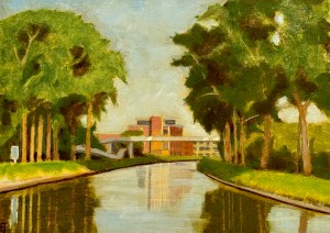
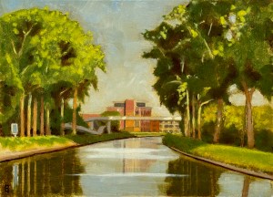
Yet strangely enough, by the next day (which was yesterday), the painting was dry to the touch(!!!). FYI: I use a painting emulsion that helps to keep my oils lean and also speeds up drying time but still, this felt like a record. So, since the weather was perfect and the seasonal clock was ticking I decided to venture out and see what might happen. After another two hour session I came up with the image you see here.
Am I happy? Happy enough. And relative to the challenge I had set for myself, I feel successful. As a painting of the countryside around here, it’s a good image of a late summer afternoon, with light on these magnificent canals. Additionally, it’s the kind of skill/experience that tends to build upon itself. So if I’m lucky, there might be a few Indian Summer days left for a few more shots from this quiver. Stay tuned.
If you are interested in this piece shoot me an email.