I’m just back from a quick trip to Sedona. The impetus for the visit was primarily family but still, I was able to squeeze in a few watercolors.
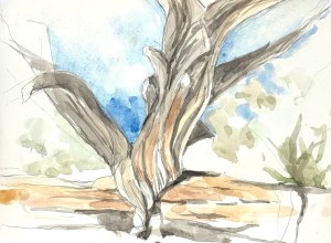
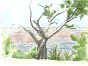
The first was a wiry tree next to a location called Montezuma’s Well. (It’s the site of an ancient sink hole, just outside of Sedona, which is filled with spring water and was used by the Sinagua Indians.) The view from above the well did not speak to me but the wiry tree next to the main lookout did. I sat down and had about an hour and a half to grab something before my companions would reappear – and also before the light had changed. Luckily, for me, for watercolors, there was plenty of value/contrast in the subject matter so the resulting painting is a bit bolder than I am usually able to achieve. As the light moved toward noon, the shadows intensified. Additionally, there were accents of color in the tree, rocks and surrounding vegetation. Voila!
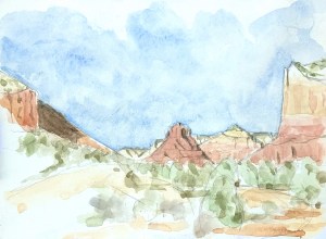
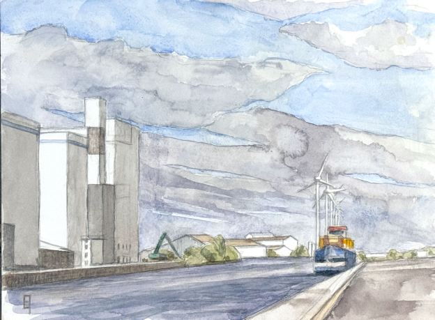
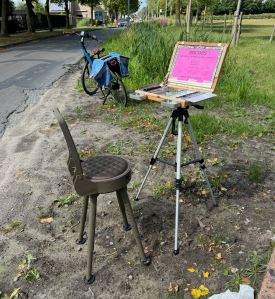
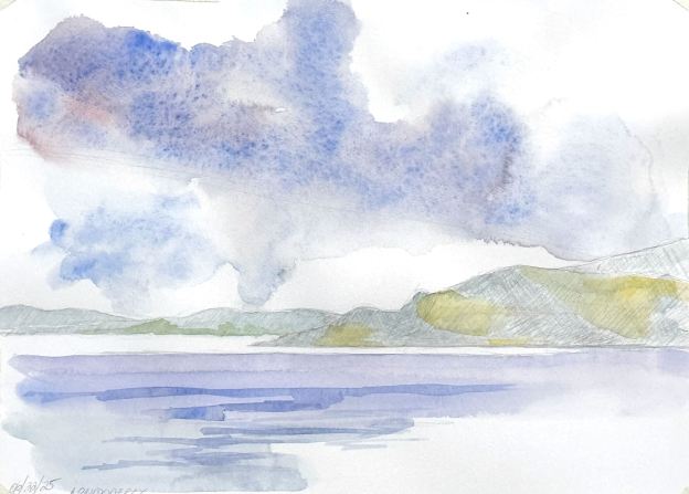
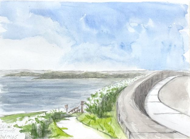
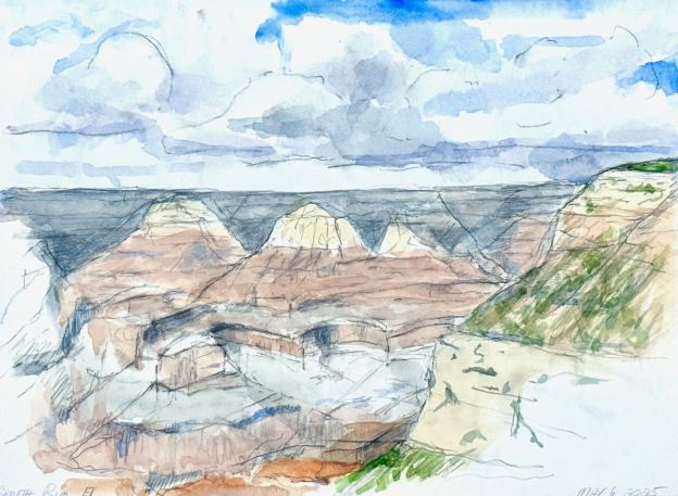
The second watercolor is a long, landscape composition from the Red Rock Ranger Station. You discover this turnout just as you enter the Sedona area from highway 17. I sat at the lookout area for about two hours in the mid to late afternoon. For anyone who has been to the area, you know that the late afternoon sunset upon the already red rocks creates a dazzling display of brilliant warmth that can be absolutely mind-blowing. Well, I wasn’t gonna try to capture that (this time), I just wanted to get in a reasonably accurate statement that would allow me to place the shadows where they belonged as the afternoon progressed.
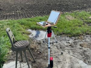
I worked about an hour getting my drawing in. I prefer to use a gestural charcoal pencil to feel my way into the flow of shapes and proportional relationships in a subject. After I’ve got something that I like, I use a kneaded eraser to erase the charcoal (I don’t leave it there because it can bleed into the paint during the watercolor session). Nevertheless, the charcoal does leave a ghosted image that I then go over with a fine graphite pencil to define the edges of the shapes to come. (I avoid using a graphite pencil for the beginning stage because any rubber erasure tends to abrade the surface of the paper in an unfortunate way – and my initial strokes aren’t always right).
Once the composition felt complete enough, and knowing that the afternoon light was moving quickly, I broke out my watercolor box. I had a feeling about how I wanted to handle my washes, and I knew I had only about an hour to do so. The central feature was, of course, the red rock front-and-center but it was balanced on either side by the cliffs, like bookends. The far distance had plenty of (subdued) interest to capture, while the rhythms of foliage and earth in the foreground allowed me to guide the viewer in. Luckily, the day was neither too warm (so my wet-in-wet washes didn’t evaporate too quickly), nor too cold (so my fingers didn’t freeze). Finally, as with any painting, you need to know when to stop.
So I did.
I might be able to do better on another day but for today. I was happy. Happy that I was able to create a reasonable expression of this majestic and beautiful place.