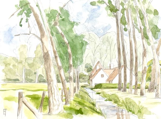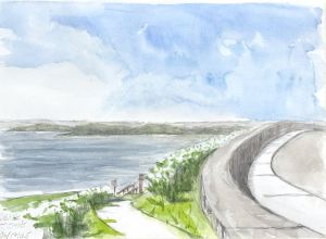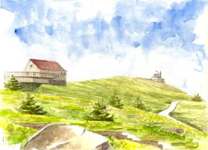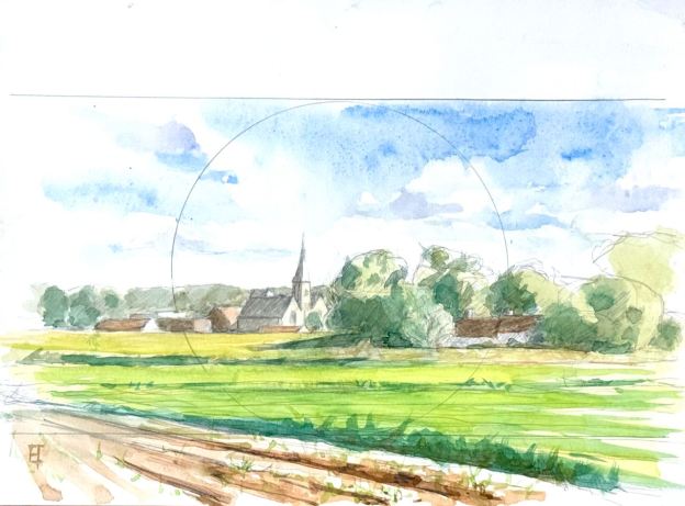
Last week I created a watercolor of this sweet little landscape that I discovered just outside of Bruges near the Fort van Beieren. I’m always on the lookout for landscapes that combine nature with a few geometrical, manmade shapes. And when the light spotlights these shapes, I’m in hog heaven. This one, including the white washed sides of a red roofed farm house, surrounded by fields and a small creek had all the ingredients I’m usually on the look out for. So, the watercolor was fine, but I was particularly interested in the intensity that can only oil can offer.
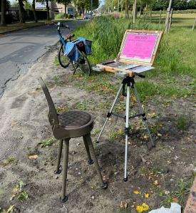
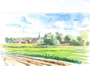
I transposed the composition from the watercolor – since that saves making a ton of new decisions in the field. I used india ink and silverpoint on a chalk gesso panel, then gave it a quick shellac-seal for protection and to reduce absorbency.
The first painting session last Saturday involved laying in a yellow ochre tint into which I blocked in the values and tints of all the basic forms. At the end of that session I had a good, gestural underpainting, everything was understated, earthy and yet harmonized. Ever since I changed my recipe last year to egg yolk (instead of a methyl cellulose glue) for my painting emulsion, I’ve had good success – both in drying time as well as fluid paint handling. Encouraging!
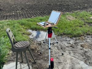
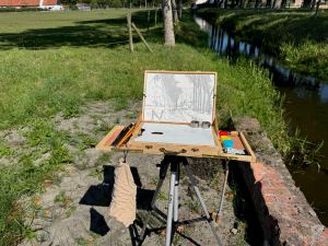
The underpainting was dry to the touch after two days(!). I went out yesterday to see what might happen. The weather was perfect. Warm and sunny with a gentle breeze. I set up my traveling oil pochade box and set to work (it has a different design than my traveling drawing/watercolor box due to the requirements of the different media). The time passed. After three hours I looked back happy and decided to call it a day. (“Day!”)

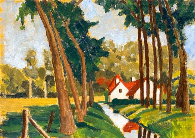
I love the white building gently nested near the center, with the mirrored creek leading forward. The complimentary colors of organic reds and greens provide all the passion this kind of landscape evokes. The trees gawkily bend upwards: my kind of cathedral. Here’s hoping the weather continues to provide a few more opportunities to my Belgian muse.
If you are interested in this piece shoot me an email.